Design Nomenclature / Color
Helmholtz–Kohlrausch effect
Also called H-K effect, chromatic lightness
- Color
- Light & Optics
- 2D & 3D
This entry has not been translated yet and is shown in English.
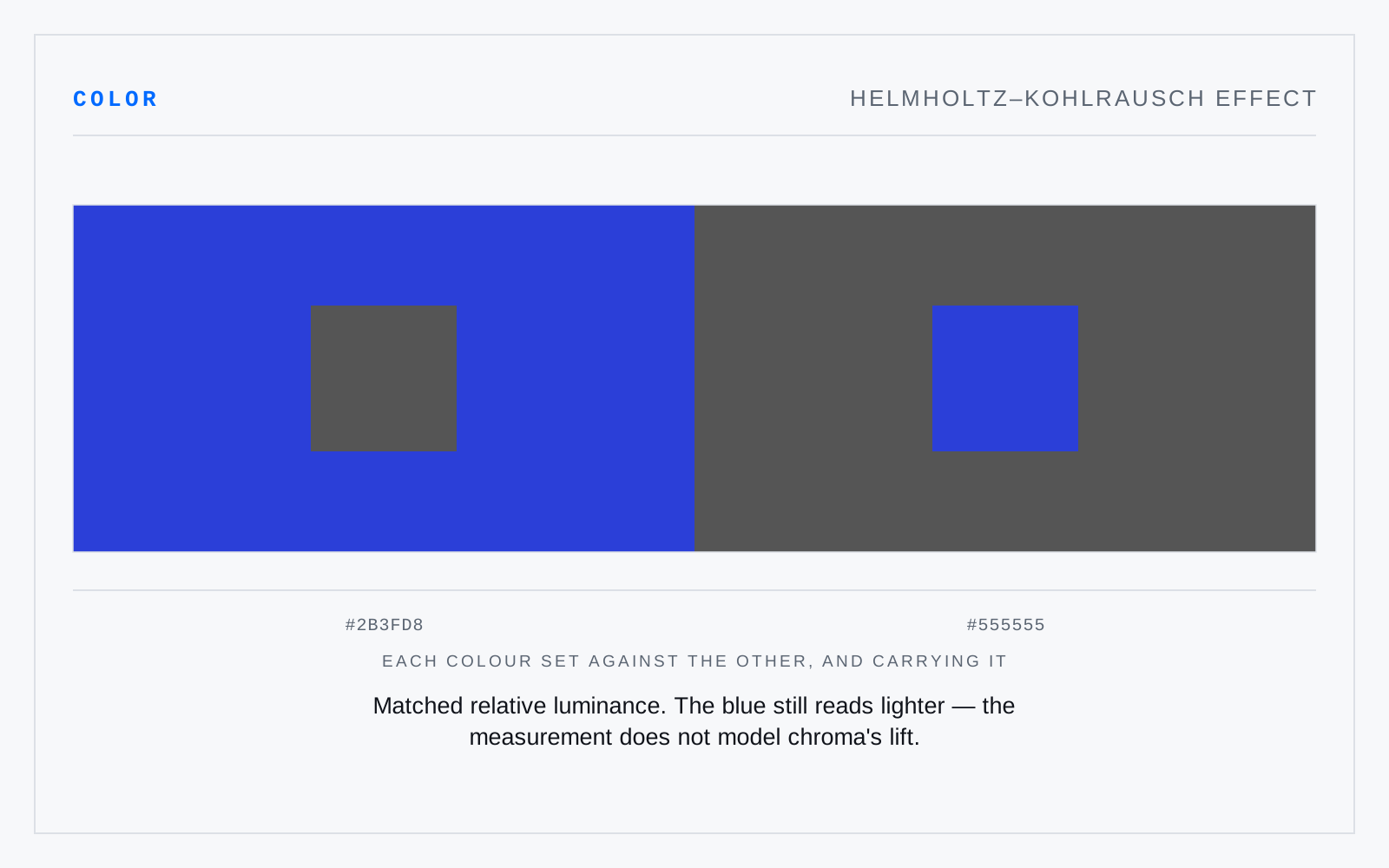
Saturated colors looking lighter than their measured luminance says they should, the gap widening with chroma and largest around blue and red. A vivid blue and a mid grey can share a luminance and refuse to share an apparent lightness — neither CIELAB's L* nor WCAG's relative luminance accounts for it.
In practice
Why a saturated brand blue can pass a contrast check on a dark ground and still read as glowing rather than legible. The number is not wrong; it is measuring something narrower than what you see.
Not to be confused with
- Purkinje shiftAs light falls and vision hands over from cones to rods, peak sensitivity moves from about 555 nm to 505 nm. Reds darken toward black and blues hold their luminance — which is why a red geranium that outshone the foliage at noon goes flat and dead at dusk while the leaves stay legible.
- ValueHow light or dark a color is, independent of hue and chroma — the one attribute that survives conversion to greyscale. Value does the structural work: legibility, depth, and figure-ground separation all rest on value difference far more than on hue difference, and a composition that fails in greyscale was leaning on hue to hide it.