Design Nomenclature / Type
Overshoot
Also called overhang
This entry has not been translated yet and is shown in English.
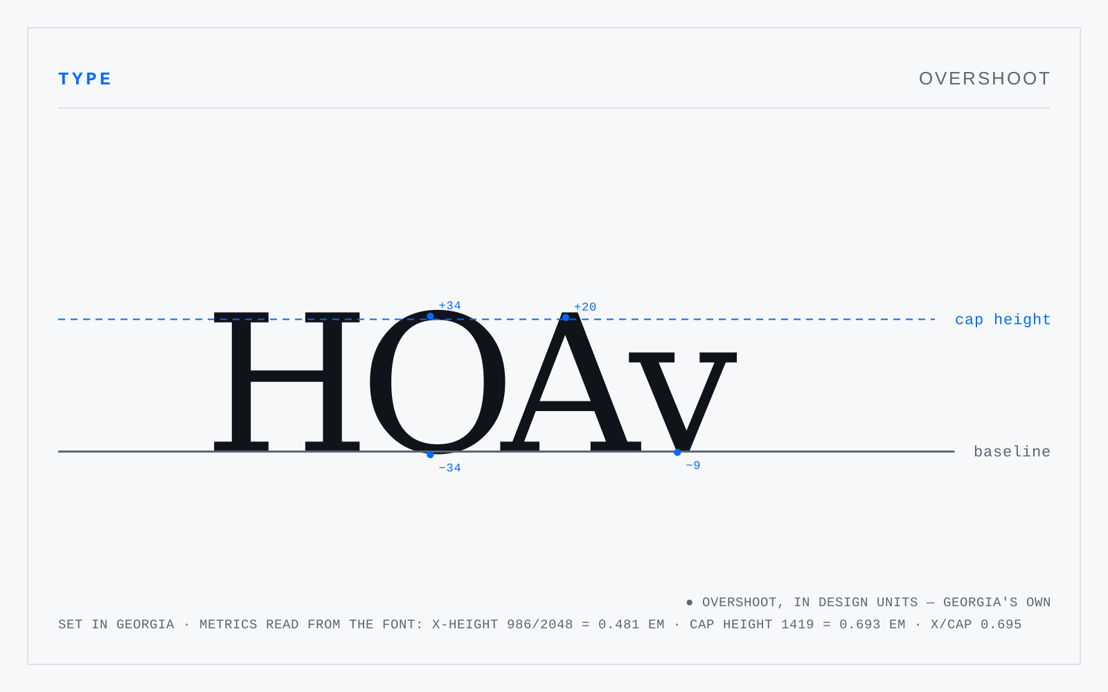
The small amount by which round and pointed letters extend past the baseline, mean line or cap line so that they appear the same size as flat-sided ones. A geometrically aligned O reads as smaller than an adjacent H; typically one to one-and-a-half percent of the em corrects it. Purely optical, never measured by the reader.
In practice
The same correction applies to circles and triangles in an icon set. Aligning UI shapes mathematically to a text baseline is the standard way to make them look wrong.