Design Nomenclature / Systems & Spec
Rem
Also called root em, root-relative unit
This entry has not been translated yet and is shown in English.
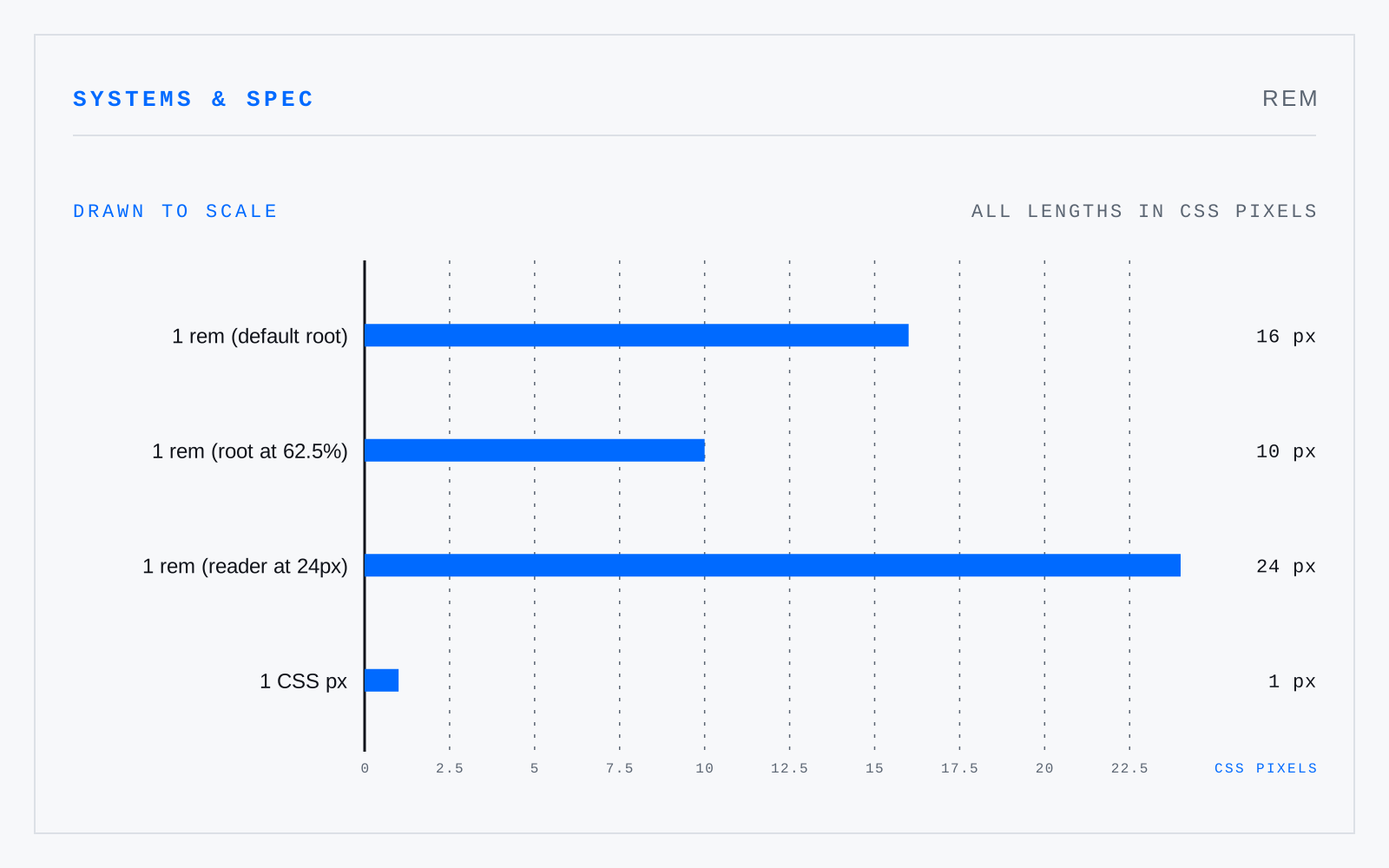
A CSS length equal to the computed font size of the root element — 16px by default, and whatever the reader has set otherwise. Unlike em it does not compound through nesting, and unlike px it honours a browser font-size preference, which is what makes sizing in rem an accessibility decision rather than a style one.
In practice
Setting the root to 62.5% so the arithmetic comes out in tens is harmless. Setting the root to a pixel value is not — that discards the reader's preference entirely.
Not to be confused with
- EmA relative unit equal to the current type size: at 16px, one em is 16px. It is not the width of an M and never was a measurement of any glyph — it is the height of the body the type is set on, which historically was square at the M's cast width. Every other type metric is expressed as a fraction of it.
- CSS pixelThe abstract unit CSS lengths resolve to: an angular reference — about 1/96 inch at arm's length, a visual angle near 0.0213° — rather than a hardware pixel. It maps to device pixels through the device pixel ratio, so one CSS px is two or three physical pixels on most phones, and more again under zoom.
- PointThe unit of type size, standardised as exactly 1/72 inch by PostScript and every application since. Historically it was never one thing: the Anglo-American point ran near 1/72.27 inch, the Didot point near 0.376 mm, Fournier's smaller again — which is why old specimens don't convert cleanly to anything.