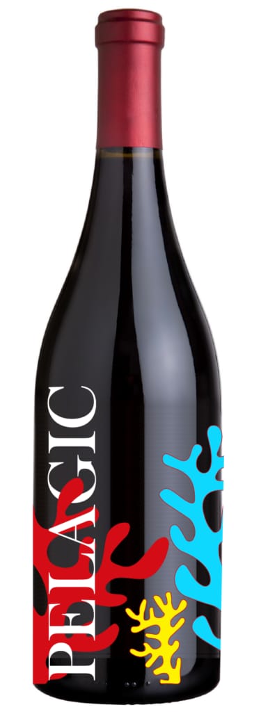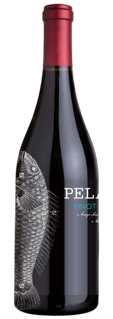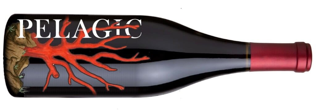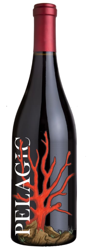
Every designer keeps a shelf of self-initiated work — the studies where no client brief constrains the question. This series asked one: how painterly can a wine label be — Matisse in a bottle, as the original notes put it — before the practical duties of the genre (varietal, vintage, legibility at arm's length across a store aisle) stop working?
The studies push illustration and typography to carry the entire brand, with the label's mandatory information composed as part of the artwork rather than appended to it. Packaging is typography with physics: curvature, glass, condensation, and shelf light all edit your type for you. These bottles were the tuition.