Design Nomenclature / Composition
Alignment
This entry has not been translated yet and is shown in English.
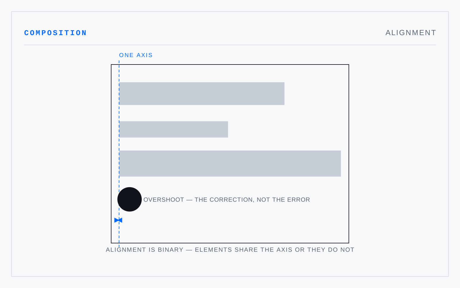
The sharing of an edge or an axis by elements not otherwise connected. Alignment creates an implied line the eye follows and structure it can trust, and it is binary: elements align or they do not. Near-alignment is the most common and most visible error in layout.
In practice
Optical alignment beats mathematical alignment. Round and pointed forms must overshoot a flat edge to look aligned — the overshoot is the correction, not the error.
Not to be confused with
- GridA structure of repeated divisions — columns, rows, gutters, margins — fixing where elements may start and stop. Its value is decisional rather than aesthetic: it turns each placement from a judgment into a lookup, so a body of pages holds together across time and across hands.
- Optical centerThe point a viewer takes for the centre of a field, which sits above the geometric centre — conventionally by around five percent of the height, more in tall formats. Anything centred by measurement therefore reads as low, and has to be raised in order to look centred.