Design Nomenclature / Composition
Hierarchy
Also called visual hierarchy
This entry has not been translated yet and is shown in English.
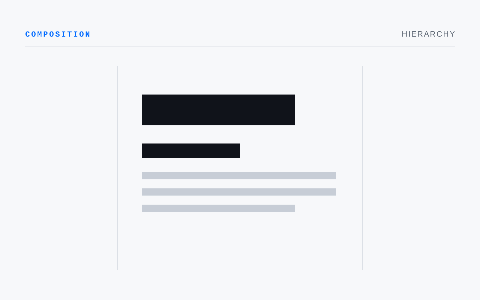
The ordering of a composition's parts by intended attention, expressed through weight, scale, position, and space. A hierarchy is a claim about what matters, made visible; it works when a viewer can rank the parts without reading them. Each level added weakens every level already there.
In practice
A typographer means the visible ranking of levels; an information architect means the tree the content actually forms. They should agree, and frequently don't.
Not to be confused with
- Typographic hierarchyThe ordering of text by importance through typographic means — size, weight, case, colour, space, position, and the choice of face. Size is the crudest lever and the most overused; weight and, above all, space do more work with less. Three levels a reader can hold is usually the ceiling.
- EmphasisThe deliberate raising of one element above the field — by contrast, isolation, scale, placement, or the direction of the forms around it. The element so raised is the focal point. Emphasis works by difference from a settled field, so it cannot be applied to everything at once.