Design Nomenclature / Type
Italic
- Type
- 2D
This entry has not been translated yet and is shown in English.
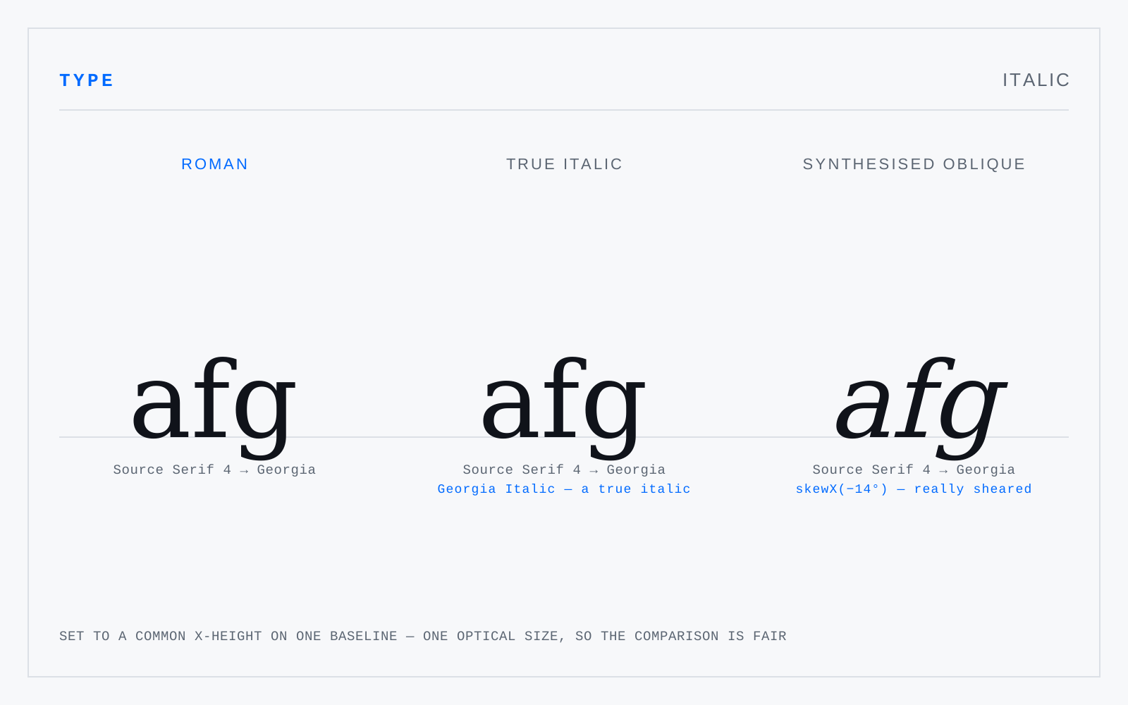
A separately drawn companion to a roman, based on a cursive hand: narrower, with different letter structures — a single-storey a, an f with a descender, entry and exit strokes — not merely a slanted roman. Italics began as standalone text faces in the 1500s and only later became the roman's subordinate partner for emphasis.
In practice
Emphasis, not passages. A paragraph of italic reads measurably slower, and browsers will synthesise a slanted roman if the real italic isn't loaded — check that font-style: italic is getting a file, not a shear.