Design Nomenclature / Type
Justification
Also called justified setting, flush both
This entry has not been translated yet and is shown in English.
Setting text flush to both margins by varying the space within each line — chiefly word spacing, with letter spacing and glyph scaling as further, uglier levers. It needs a generous measure and working hyphenation to hold together. Without both it produces rivers, gappy lines, and worse readability than a plain rag.
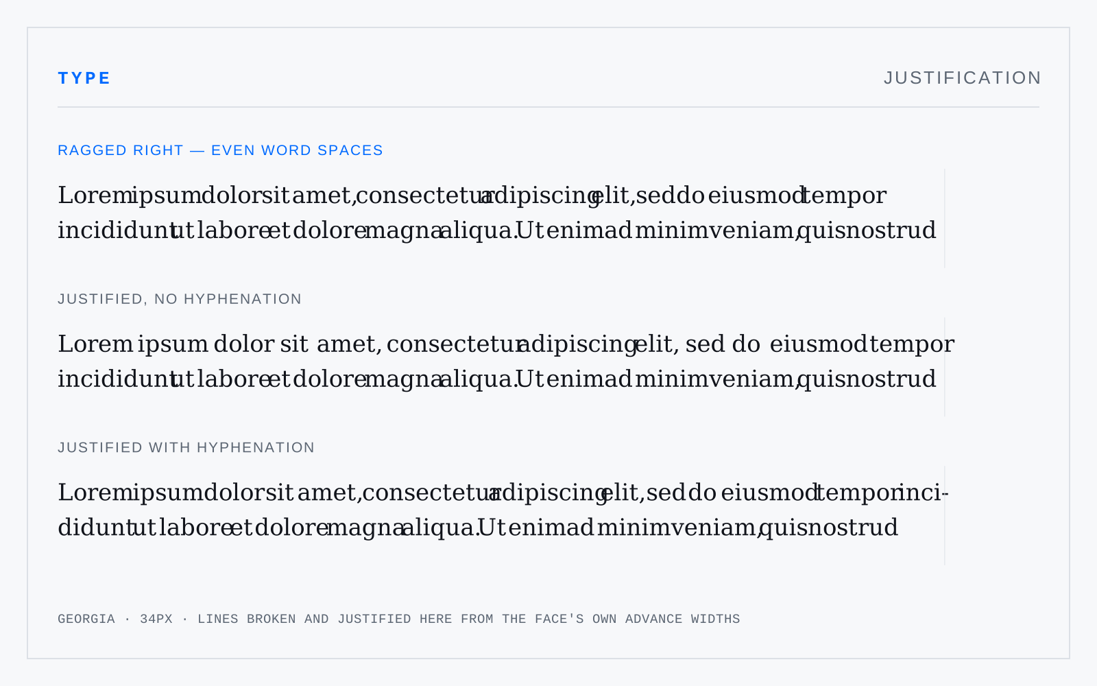
In practice
text-align: justify without hyphens: auto is the single most common self-inflicted typographic wound on the web. If you can't hyphenate, don't justify.
Not to be confused with
- RagThe uneven edge of unjustified text. A good rag is worked, not accepted: it varies line to line without falling into a wedge, a staircase, or an accidental shape, and it never leaves a one-word line or breaks a name across lines. The reward for leaving it ragged is even word spacing throughout.
- H&JThe rule set governing how lines break and fill: minimum, optimum and maximum word spacing, permitted letter spacing and glyph scaling, how many consecutive hyphens are allowed, minimum characters before and after a break, and the hyphenation zone — the strip at the line's end within which a hyphenated break is permitted.