Design Nomenclature / Type
Legibility
This entry has not been translated yet and is shown in English.
How easily individual characters are told apart — a property of the typeface. It is measurable: aperture, x-height, stroke contrast, and distinction between confusable pairs (I/l/1, b/d, O/0, rn/m). A face can be highly legible and still make miserable reading if it is badly set.
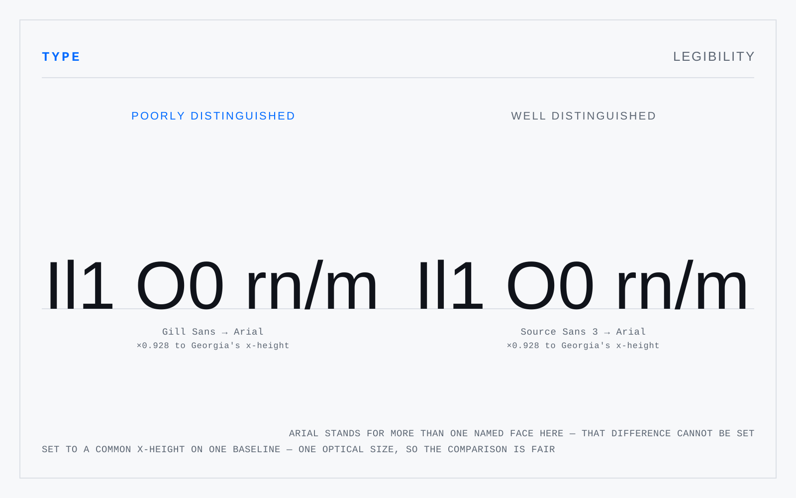
In practice
Not interchangeable with readability, though the trade uses them so. The distinction is worth holding because it separates what you fix by choosing a face from what you fix by setting it.