Design Nomenclature / Color
Contrast of light and dark
Also called light-dark contrast, tonal contrast, luminance contrast, value contrast
This entry has not been translated yet and is shown in English.
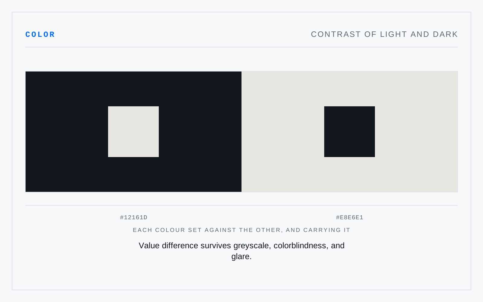
Difference carried by value. It is the only contrast every viewer receives — colorblind, low-vision, in glare, in greyscale, at a distance — which is why accessibility standards are written in luminance terms and why hue difference alone has never satisfied one.
In practice
The workhorse. If a layout reads with the color thrown away, the value contrast is doing its job and the hue is free to do something else.
Not to be confused with
- Contrast of hueItten's simplest contrast: difference carried by hue alone, strongest between unmixed primaries. It is also the weakest tool for legibility, since hue difference without value difference vanishes for dichromats and in greyscale — two colors can be maximally opposed in hue and identical in value.
- Contrast of saturationDifference between a vivid color and a muted one of similar hue and value. The quietest of Itten's contrasts and the most useful in interfaces: a single saturated element in a toned field takes the eye without any change in value, so the page stays calm while still having a subject.