Design Nomenclature / Systems & Spec
Fluid scale
Also called clamp, fluid type scale, interpolated scale, fluid typography
This entry has not been translated yet and is shown in English.
Sizing that interpolates continuously between a minimum and a maximum across a viewport range — typically CSS `clamp()` with a viewport-unit middle term — instead of stepping at breakpoints. It needs bounds and a rem term in that middle, or zoom stops working: viewport units ignore the reader's text-size preference.
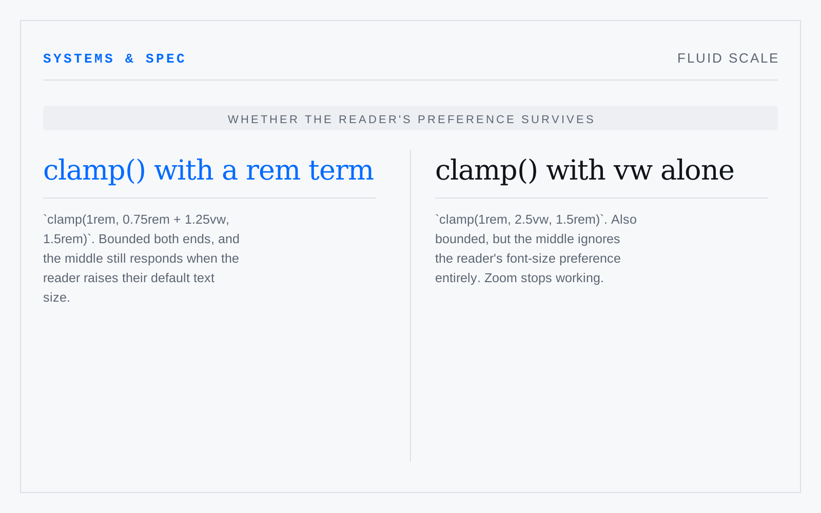
In practice
Generated by a calculator and shipped unchecked at the ends. The middle interpolates fine; it is 320px and 2560px where it embarrasses you.
Not to be confused with
- BreakpointA viewport width at which a layout rule changes. Chosen properly it sits where the content breaks, not where a named device sits: device-width lists date on release, and a layout that only holds at four widths will fail at the fifth.
- Modular scaleA set of sizes generated by multiplying a base repeatedly by a fixed ratio — 16 at 1.25 gives 20, 25, 31.25 — so every step relates to every other by the same interval. The ratio is a constraint, not evidence of quality; the useful part is ending up with fewer sizes.