Design Nomenclature / Type
Geometric sans
- Type
- 2D
This entry has not been translated yet and is shown in English.
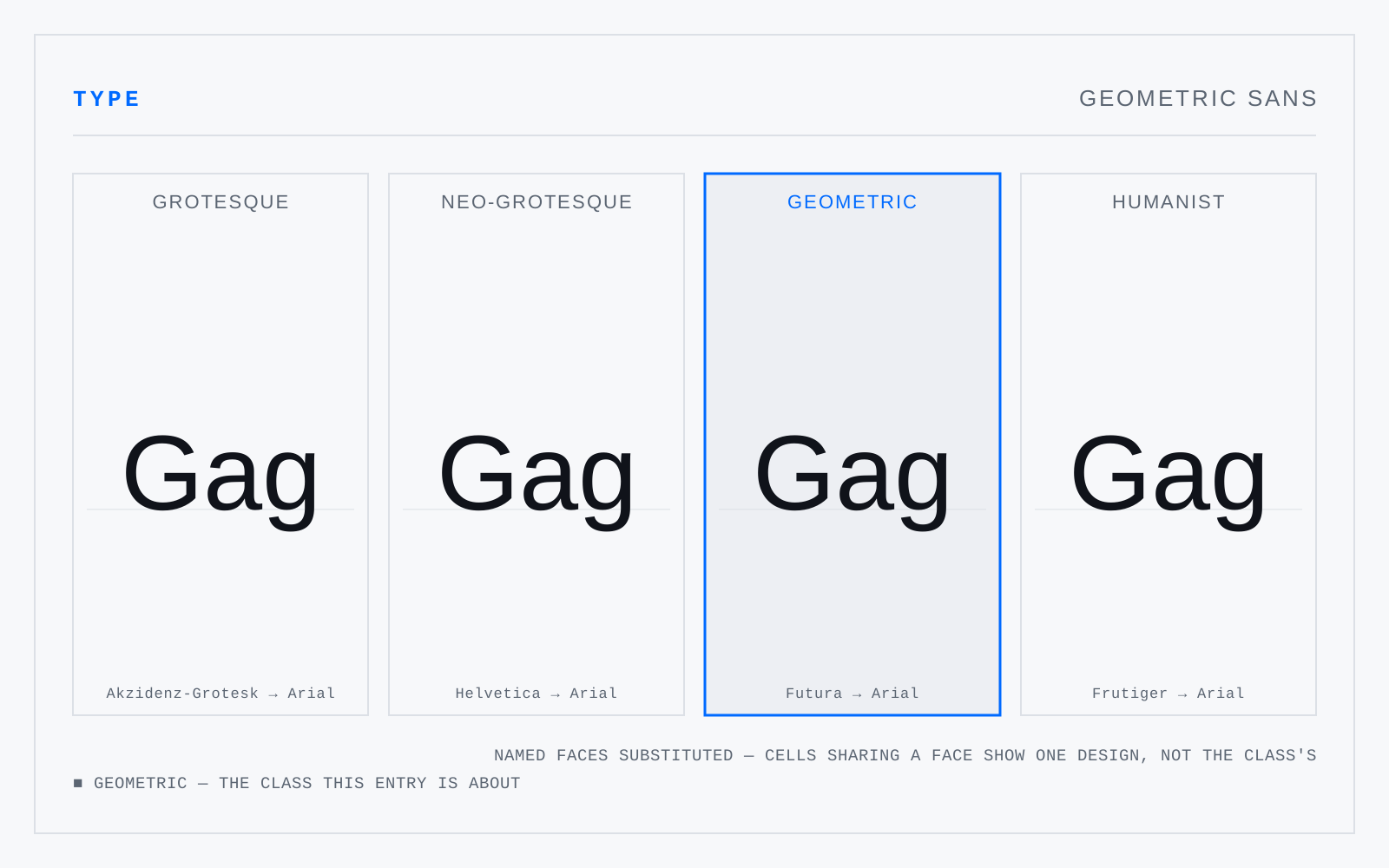
Sans serifs built from circle, square and triangle — Futura, Erbar, Kabel, and their descendants. Near-monoline, single-storey a, circular o, long ascenders over a small x-height. The geometry is always partly a fiction: an honestly circular o reads as too wide and too dark, so the drawn o is corrected.
In practice
The default in tech branding for a decade and a poor text face throughout — uniform circular counters make e, o, c and a converge exactly where a reader needs them apart.
Not to be confused with
- Humanist sansSans serifs drawn on the proportions of the humanist roman rather than on geometry — Gill Sans, Frutiger, Myriad, Source Sans. Varied letter widths, some stroke modulation, a double-storey a and usually g, and open apertures. The class the legibility literature keeps landing on for interfaces and signage.
- Neo-grotesqueThe 1950s rationalisation of the grotesque — Helvetica, Univers, Folio. Irregularities planed off, terminals cut horizontally, apertures closed tighter, fitting tightened, and the family systematised across weights and widths. Immensely successful as branding; measurably weaker than humanist sans at small sizes and under blur, because those closed apertures fold c toward o.