Design Nomenclature / Type
Slab serif
Also called Egyptian, mécane, square serif
- Type
- 2D
This entry has not been translated yet and is shown in English.
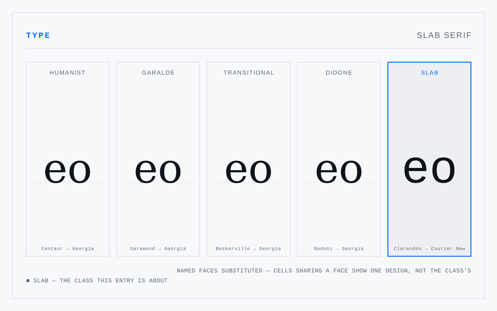
Faces whose serifs are heavy rectangles roughly the weight of the stems, with contrast near nil. Two branches that behave differently: bracketed Clarendons, which are workable text faces, and unbracketed geometrics like Memphis and Rockwell, which are display faces wearing text clothes.
Not to be confused with
- DidoneThe high-contrast romans of around 1800 — Bodoni, Didot, Walbaum. Exactly vertical stress, abrupt and extreme thick-to-thin, unbracketed hairline serifs meeting the stem at a right angle, ball terminals, tight fitting. Cut for smooth paper and precise presses; on anything coarser, or any low-density screen, the hairlines vanish.
- GrotesqueThe nineteenth-century sans serifs — Akzidenz-Grotesk, Franklin Gothic, News Gothic. Slight irregularity between letters, a squarish rather than circular bowl, closed apertures, a spurred G, and a lowercase g that is usually single-storey with an open tail. Warmer and less systematic than what followed.
Origin
Called Egyptian from the 1810s on — Napoleon's Egyptian campaign had made anything Egyptian saleable, and the types have nothing whatever to do with Egypt.