Design Nomenclature / Type
Em
Also called em quad, mutton
This entry has not been translated yet and is shown in English.
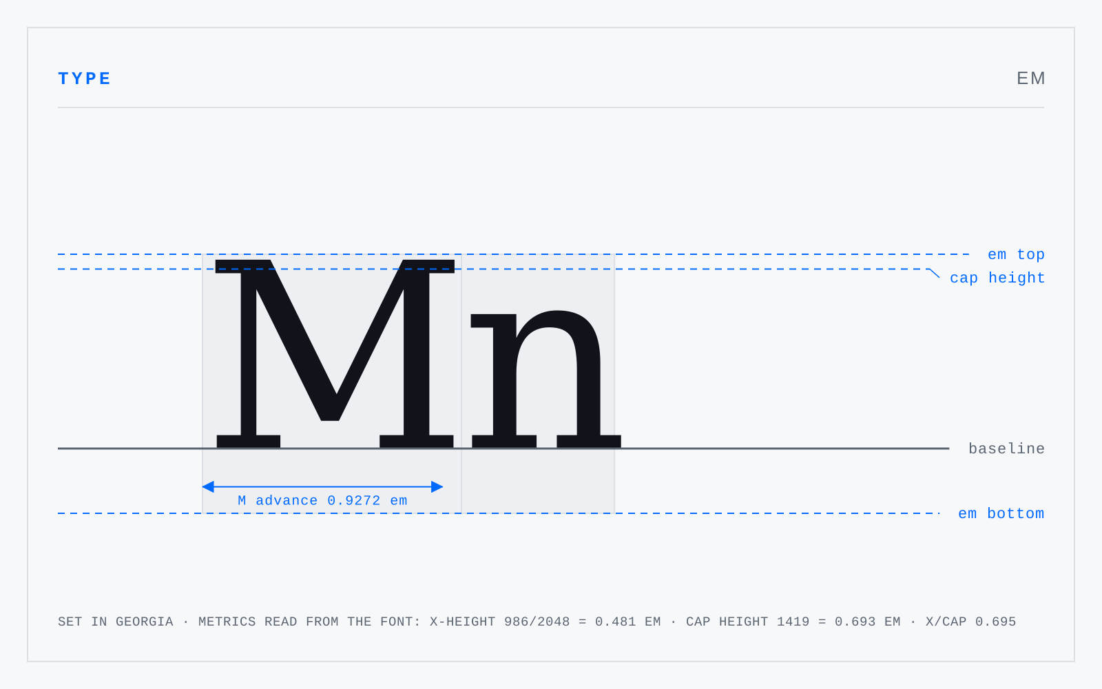
A relative unit equal to the current type size: at 16px, one em is 16px. It is not the width of an M and never was a measurement of any glyph — it is the height of the body the type is set on, which historically was square at the M's cast width. Every other type metric is expressed as a fraction of it.
In practice
In CSS em compounds against the parent's computed size, which is why rem exists. Use rem for type scales, em for things that should track their own element's size — padding, indents, spacing.
Not to be confused with
- EnHalf an em. Its practical residue is the dash: the en dash spans ranges and compound relations (1914–18, the Paris–Lyon line), the em dash breaks a sentence — like this. The old compositors' names, mutton and nut, existed precisely because "em" and "en" are indistinguishable when spoken across a noisy room.
- PointThe unit of type size, standardised as exactly 1/72 inch by PostScript and every application since. Historically it was never one thing: the Anglo-American point ran near 1/72.27 inch, the Didot point near 0.376 mm, Fournier's smaller again — which is why old specimens don't convert cleanly to anything.
Origin
Named for the capital M, which in early roman fonts was cast on a square body — so the M's body, not its letter, gave the square its name.