Design Nomenclature / Systems & Spec
Focus indicator
Also called focus ring, focus visible, SC 2.4.7
This entry has not been translated yet and is shown in English.
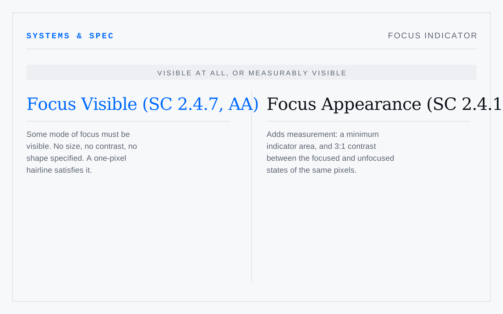
The visible marker showing which control holds keyboard focus. WCAG 2.0 SC 2.4.7 (AA) requires only that some mode of focus is visible. WCAG 2.2 adds SC 2.4.11 Focus Not Obscured at AA, and SC 2.4.13 Focus Appearance at AAA, which sets a minimum indicator area and 3:1 contrast between focused and unfocused states.
In practice
Deleted with `outline: none` far more often than it is designed. The browser default is ugly and load-bearing; replacing it is fine, removing it is a failure.
Not to be confused with
- Non-text contrastWCAG 2.1 SC 1.4.11, Level AA: user interface components, their states, and the parts of graphics needed to understand content must reach 3:1 against adjacent colour. Input borders, icons, chart keys, focus and selection states — everything a 4.5:1 text audit walks straight past.
- Target sizeThe area that responds to a pointer or touch, measured in CSS pixels. WCAG 2.2 SC 2.5.8 Target Size (Minimum) sets 24×24 at Level AA, with exceptions for inline links, adequate spacing, and equivalent controls elsewhere; SC 2.5.5 Target Size (Enhanced) sets 44×44 at Level AAA.