Design Nomenclature / Type

Lining figures

Also called titling figures, lnum

This entry has not been translated yet and is shown in English.

Numerals of uniform height, aligned on the baseline and reaching to cap height or a little below. The default in most faces since the nineteenth century, and the right choice beside capitals, in tables, and in interfaces. Beside lowercase they read as slightly loud, which is what oldstyle figures were kept for.
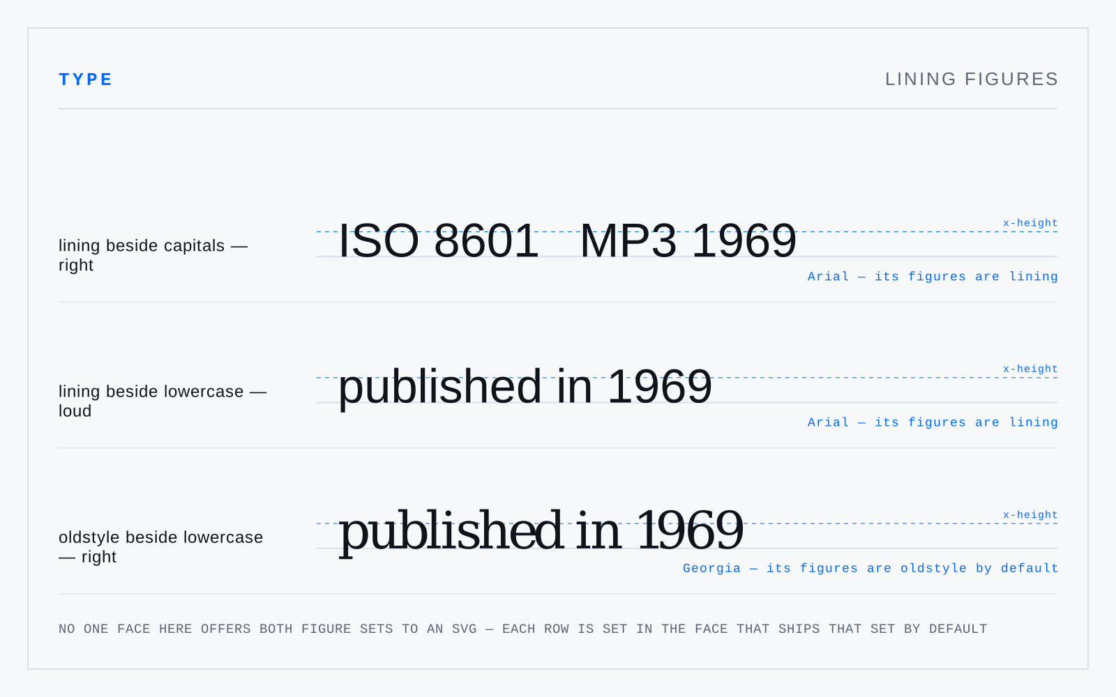
Three rows, each on its own baseline with a dashed x-height rule across it. 'Lining beside capitals — right' sets ISO 8601 and MP3 1969 in Arial, whose figures are lining: the digits stand level with the capitals. 'Lining beside lowercase — loud' sets 'published in 1969' in Arial, the digits towering over the x-height rule. 'Oldstyle beside lowercase — right' sets the same sentence in Georgia, whose figures rise and fall with the lowercase. The two sentences are set in different faces — each row prints which, because no one face here offers both figure sets to an SVG — so the comparison carries a face change with it.

Not to be confused with

How this term connects

Cap heightOldstyle figuresOpenTypeTabular figuresLining figures
Related Confused with