Design Nomenclature / Color
Tone
Also called muted color, broken color
- Color
- Composition
- 2D & 3D
This entry has not been translated yet and is shown in English.
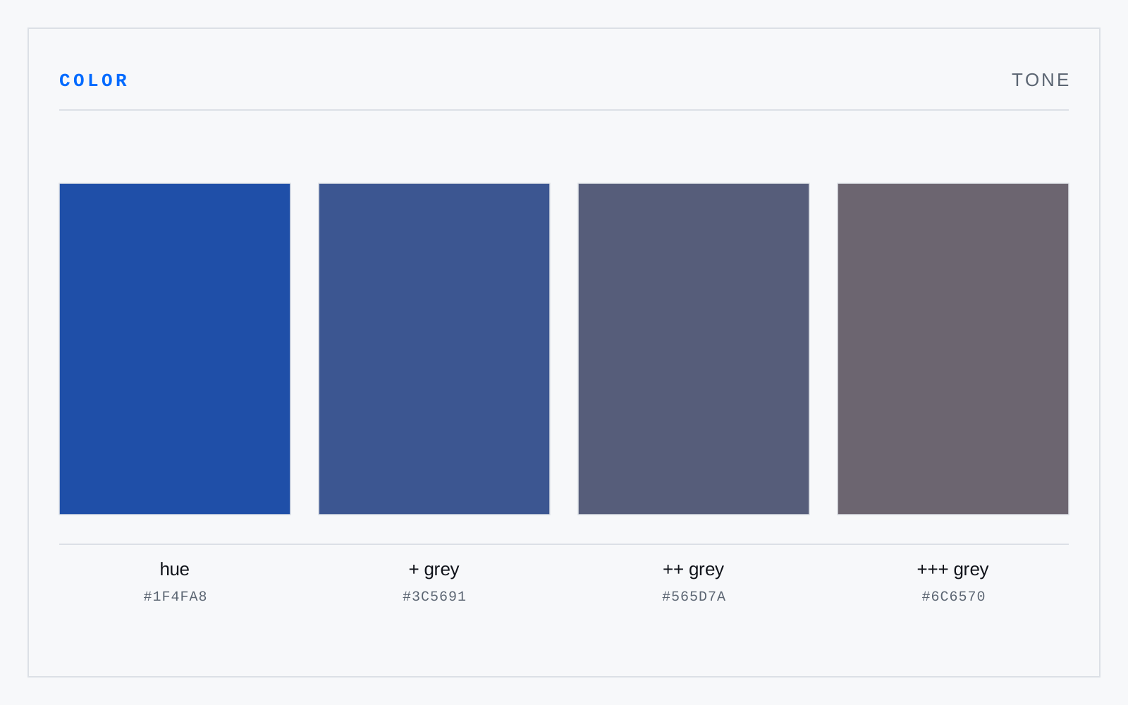
A hue with grey added — chroma reduced without a committed move in value. Toning is how a palette is made to sit together: most color that reads as considered has been toned, because a shared grey pulls otherwise unrelated hues onto common ground and lets the saturated accent carry the emphasis.
In practice
The most overloaded word in color. Painters mean hue plus grey; photographers and printers mean value; common British usage means the whole light-dark structure. Ask which.
Not to be confused with
- TintA hue with white added — lighter and, in pigment, lower in chroma than the parent. Tinting raises value while pulling toward the achromatic axis, which is why pastels read as soft rather than merely pale: the white dilutes the colorant as it lifts it.
- ShadeA hue with black added — darker and lower in chroma than the parent. Black is a blunt instrument: it kills chroma quickly and drags most hues toward a muddy olive, which is why painters darken with a complement or a dark analogous hue and reach for black last.
- ValueHow light or dark a color is, independent of hue and chroma — the one attribute that survives conversion to greyscale. Value does the structural work: legibility, depth, and figure-ground separation all rest on value difference far more than on hue difference, and a composition that fails in greyscale was leaning on hue to hide it.