Design Nomenclature / Type
Typographic hierarchy
Also called type hierarchy, font hierarchy
This entry has not been translated yet and is shown in English.
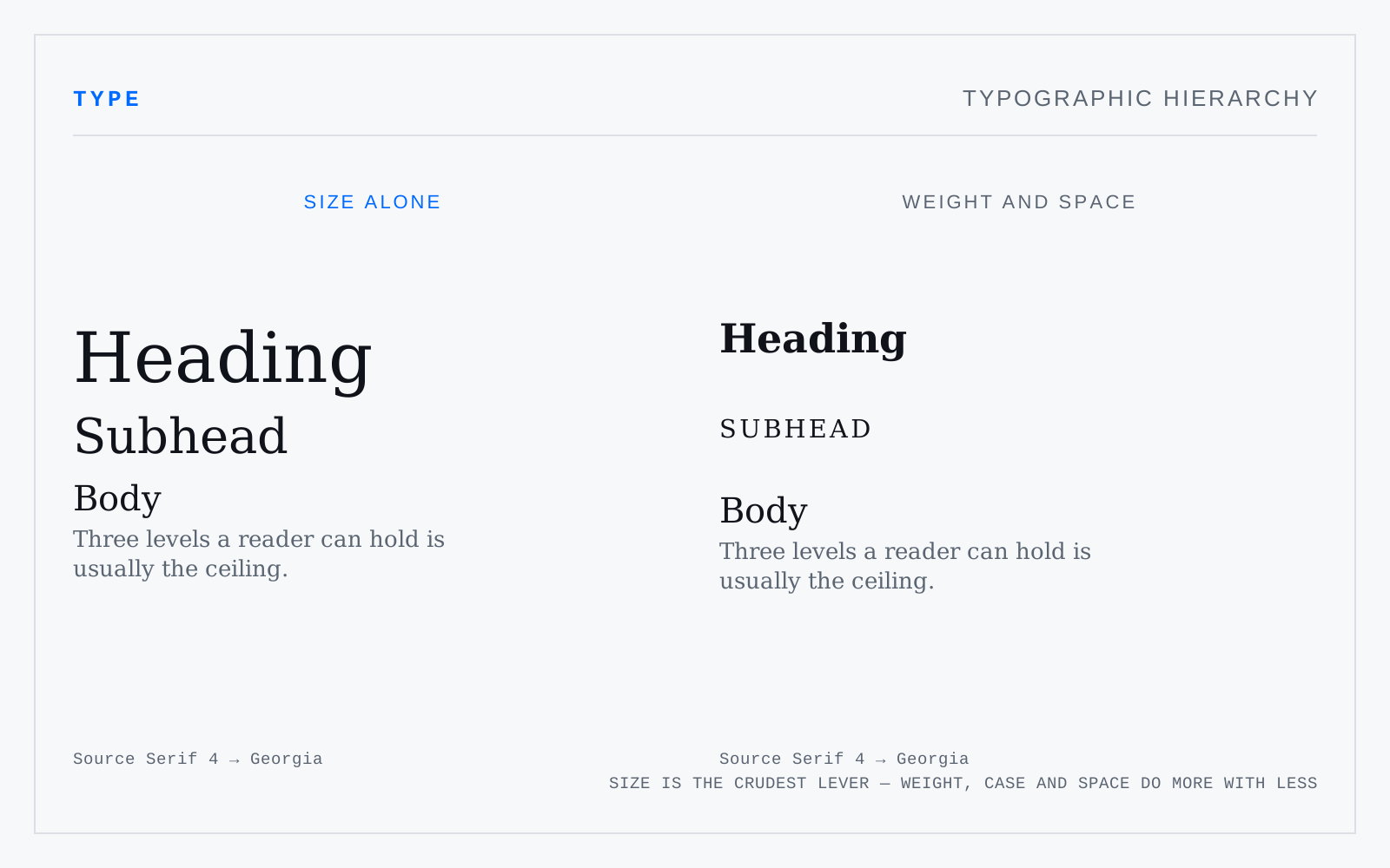
The ordering of text by importance through typographic means — size, weight, case, colour, space, position, and the choice of face. Size is the crudest lever and the most overused; weight and, above all, space do more work with less. Three levels a reader can hold is usually the ceiling.
In practice
Visual hierarchy is not document structure. Styling a div to look like a heading gives a screen-reader user nothing; WCAG 1.3.1 wants real h1–h6, and the visual order should follow them rather than the reverse.