№ 004ジャーナル
執筆.
デザイン、開発、タイポグラフィ、そしてウェブづくりの職人技についての考察。
- PETGでつくるフィールドキット80あまりのプリントパーツが、空飛ぶ磁力計を支えています。クランプ、クレードル、カプラー、そして曳航式センサーポッド——すべて卓上機で一晩のうちにプリントしたものです。フィールドエンジニアリングの実践としての3Dプリントについて、リビジョンを重ねながら記した覚え書き。7 min read
- 見えない制約のためのデザイン磁場を測るドローンは、ほかのドローンと同じようには作れません。ねじの1本1本がデザイン上の意思決定です。測量用航空機が教えてくれた「制約ファースト」のデザイン——それは、20年のタイポグラフィがすでに教えようとしていたことでもありました。7 min read
- 工房のエージェントClaudeにマウント設計者、OpenSCADの書き手、プリントチェッカーという3体の専門サブエージェントを与え、実物のドローン部品を18回のリビジョンにわたって改良させました。AI支援による機械設計が実際にはどんな姿をしているかについての覚え書き。7 min read
- 書体のパフォーマンスバジェットブランド書体を載せる価値があるなら、安く載せること。4つのスタティックの代わりに1つのバリアブルファイル、容赦のないサブセット化、正直なfont-display、そしてスワップが見えなくなるまで作り込んだフォールバック。エンジニアリングの規律としてのフォント読み込み。7 min read
- バイブスの下にあるスタックバイブコーディングは機能します——私はこのやり方でポートフォリオ、AIプラットフォーム、ドローンのハードウェアを世に出してきました。しかし、それが機能するのは、流行とは無縁の3つの道具が支えているからです。取り消しのためのgit、記憶のためのGitHub、そして本当に理屈で把握できる素のLinuxサーバー。7 min read
- 0キロバイトのフォントスタック最速のウェブフォントは、配信しないウェブフォントです。高パフォーマンスなアプリケーションにとって、システムフォントスタックが正しいタイポグラフィ上の意思決定になるのはどんなときか。2026年にそれをうまく組む方法——そして、ブランド書体がそのバイト数に見合う価値を持つのはどんなときか。6 min read
- データ密度の高いインターフェースのための書体選びダッシュボード、ターミナル、監視画面が書体に問うのは、散文とは別の問いです。数字は桁の列を保てるか、11ピクセルで0とOを見分けられるか、ボールドはダークテーマで生き残れるか。プレッシャー下のインターフェースのための選定チェックリスト。6 min read
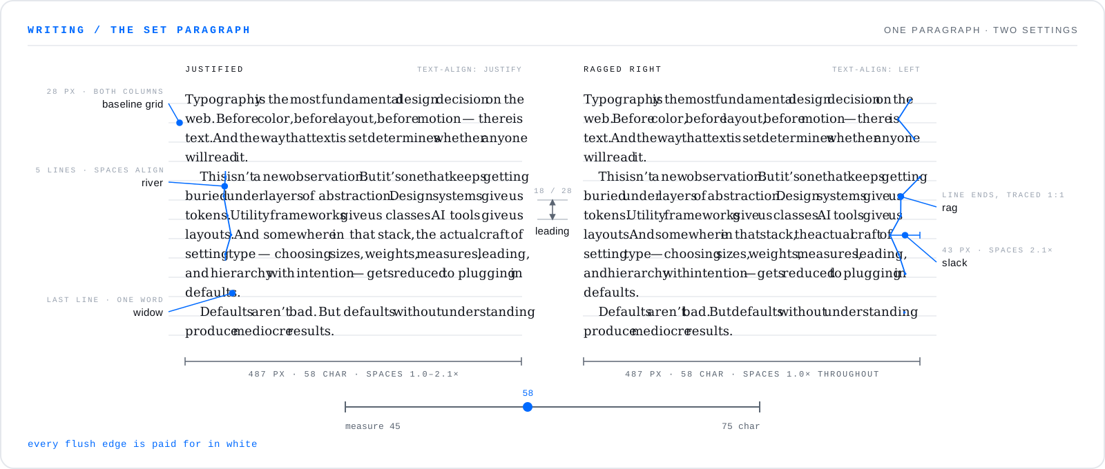
- タイポグラフィとウェブについてデザインシステム、ユーティリティクラス、AI生成レイアウトの時代に、なぜタイポグラフィの技芸がいまも重要なのか。6 min read
- 長持ちするものをつくる歳月に耐える技術とアーキテクチャの選び方、そしてシンプルさが複利で効いていく理由についての考察。5 min read