Design Nomenclature / Systems & Spec
Breakpoint
Also called media query breakpoint, responsive breakpoint
This entry has not been translated yet and is shown in English.
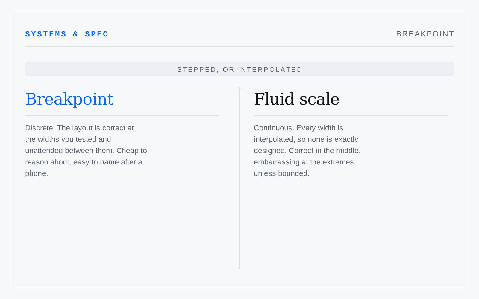
A viewport width at which a layout rule changes. Chosen properly it sits where the content breaks, not where a named device sits: device-width lists date on release, and a layout that only holds at four widths will fail at the fifth.
In practice
Named after phones and tablets, which is how you get a `tablet` breakpoint no tablet has and a desktop window nobody ever tested at.
Not to be confused with
- Fluid scaleSizing that interpolates continuously between a minimum and a maximum across a viewport range — typically CSS `clamp()` with a viewport-unit middle term — instead of stepping at breakpoints. It needs bounds and a rem term in that middle, or zoom stops working: viewport units ignore the reader's text-size preference.
- ReflowWCAG 2.1 SC 1.4.10, Level AA: content must present without loss of information or functionality, and without scrolling in two dimensions, at a width equivalent to 320 CSS pixels for vertically scrolling content and a height of 256 CSS pixels for horizontally scrolling content. Data tables and maps are excepted.