Design Nomenclature / Type
Hinting
Also called grid-fitting, TrueType instructions
This entry has not been translated yet and is shown in English.
Instructions embedded in a font telling the rasteriser how to distort outlines onto a coarse pixel grid — snap stems to whole pixels, hold the x-height level across a line, keep a hairline from vanishing. Decisive at nine pixels of x-height; close to irrelevant at 2× or 3× device pixel ratio.
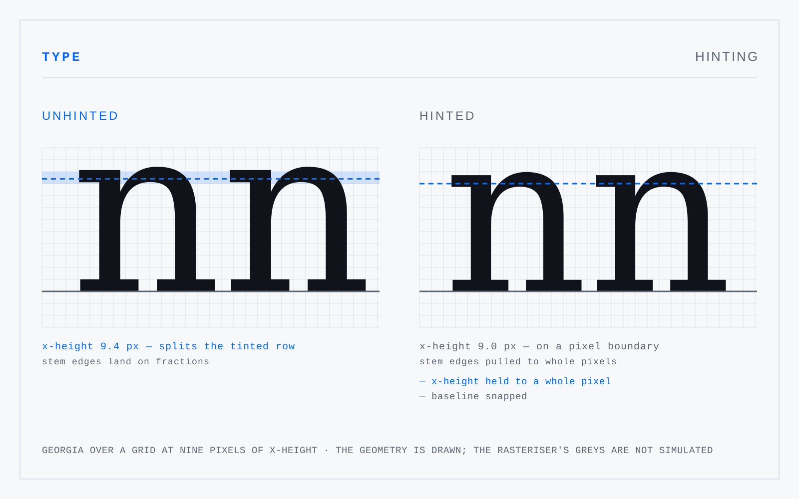
In practice
macOS has ignored hinting for years in favour of its own rasteriser; Windows at standard density still cares. Autohinting a webfont is worth it only if standard-DPI Windows is a real share of your traffic.
Not to be confused with
- Anti-aliasingReconstructing a signal the sample grid cannot represent, by weighting each pixel with the fraction of it a shape covers instead of a hard in-or-out test. It does not blur the edge; it estimates the correct value for a sample straddling one. Without it, aliasing shows up as stair-steps, shimmer, and moiré.
- Ink trapA notch cut out of a join — where shoulder meets stem, or at a tight crotch — so that ink spreading on absorbent paper fills it rather than blotting the join shut. A production countermeasure for hot-metal and newsprint conditions that no longer obtain at high resolution.