Design Nomenclature / Type
Serif
Also called schreef
- Type
- 2D
This entry has not been translated yet and is shown in English.
The finishing stroke crossing or projecting from the end of a main stroke. Serifs vary along two axes that matter: bracketed or unbracketed, and blunt, wedge, slab or hairline. They are structural, not decorative — they close a stroke, control its optical length, and lock the horizontal rhythm of a line.
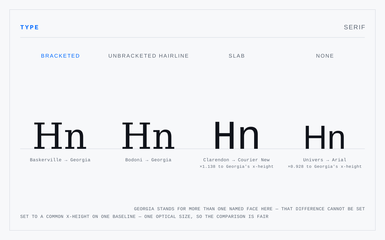
In practice
"Use sans on screen" was a resolution argument, not a legibility one, and high-density displays retired it. Choose on x-height, aperture and letter distinction instead.
Not to be confused with
- TerminalThe end of any stroke that does not finish in a serif. Named by shape: ball (Baskerville's a), teardrop, beak (the sharp spur on Perpetua's C), sheared, flared. A finial is specifically a tapered terminal, typical of italics and scripts. Terminal shape and terminal angle together set a face's aperture.
- BracketThe curved transition joining a serif to the stem it finishes. Heavy bracketing reads as warm and old-style; slight bracketing as transitional; its complete absence, with the serif meeting the stem at a raw right angle, is the signature of didones and of geometric slabs. It is also where ink gathers, hence the ink trap.
Origin
Probably from Dutch schreef, a line or stroke — the word appears in English only in the 1830s, long after the thing itself.