Design Nomenclature / Type
Optical size
Also called opsz, optical sizing
- Type
- 2D
This entry has not been translated yet and is shown in English.
A design adjusted for the size it will be set at: at small sizes, open apertures, lower contrast, looser fitting, sturdier hairlines; at display sizes, the reverse. Punchcutters had to cut every size separately and so did this by necessity. As the opsz variable axis it returns as a continuous, automatic function of font-size.
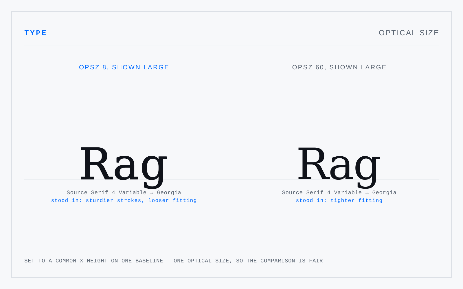
In practice
Browsers apply opsz automatically via font-optical-sizing: auto. Leave it on. Scaling one master to every size — which is what phototypesetting introduced and everyone got used to — is the thing opsz undoes.
Not to be confused with
- PointThe unit of type size, standardised as exactly 1/72 inch by PostScript and every application since. Historically it was never one thing: the Anglo-American point ran near 1/72.27 inch, the Didot point near 0.376 mm, Fournier's smaller again — which is why old specimens don't convert cleanly to anything.
- WeightStroke thickness relative to the em — the amount of black a face puts on the page. The CSS scale runs 1–1000 with 400 as regular and 700 as bold; a variable wght axis makes every value between them addressable. Weight names across foundries are not comparable: one foundry's Book is another's Light.