Design Nomenclature / Type
Faux small caps
Also called fake small caps, synthesised small caps, scaled caps
- Type
- 2D
This entry has not been translated yet and is shown in English.
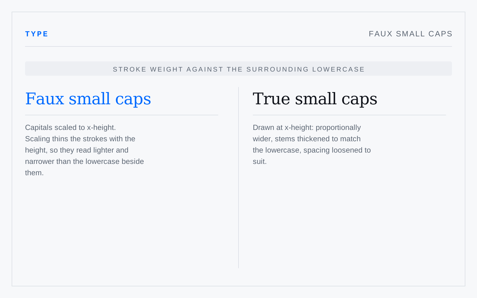
Capitals scaled down to approximate x-height. Scaling reduces stroke weight along with height, so they sit lighter and narrower than the lowercase around them and read as a grey patch. The giveaway is stem width: hold a faux small cap against the adjacent lowercase n and the mismatch is immediate.
In practice
Every browser and layout app will produce these silently when the font has no smcp. Tracking them out helps the spacing and does nothing for the weight, which is the actual problem.