Design Nomenclature / Type
Kerning
- Type
- 2D
This entry has not been translated yet and is shown in English.
Adjusting the space between one specific pair of glyphs, correcting fits the sidebearings can't get right on their own — AV, To, r. — because the correction depends on the neighbour. Fonts ship kern pairs in the GPOS table; browsers apply them by default at text sizes.
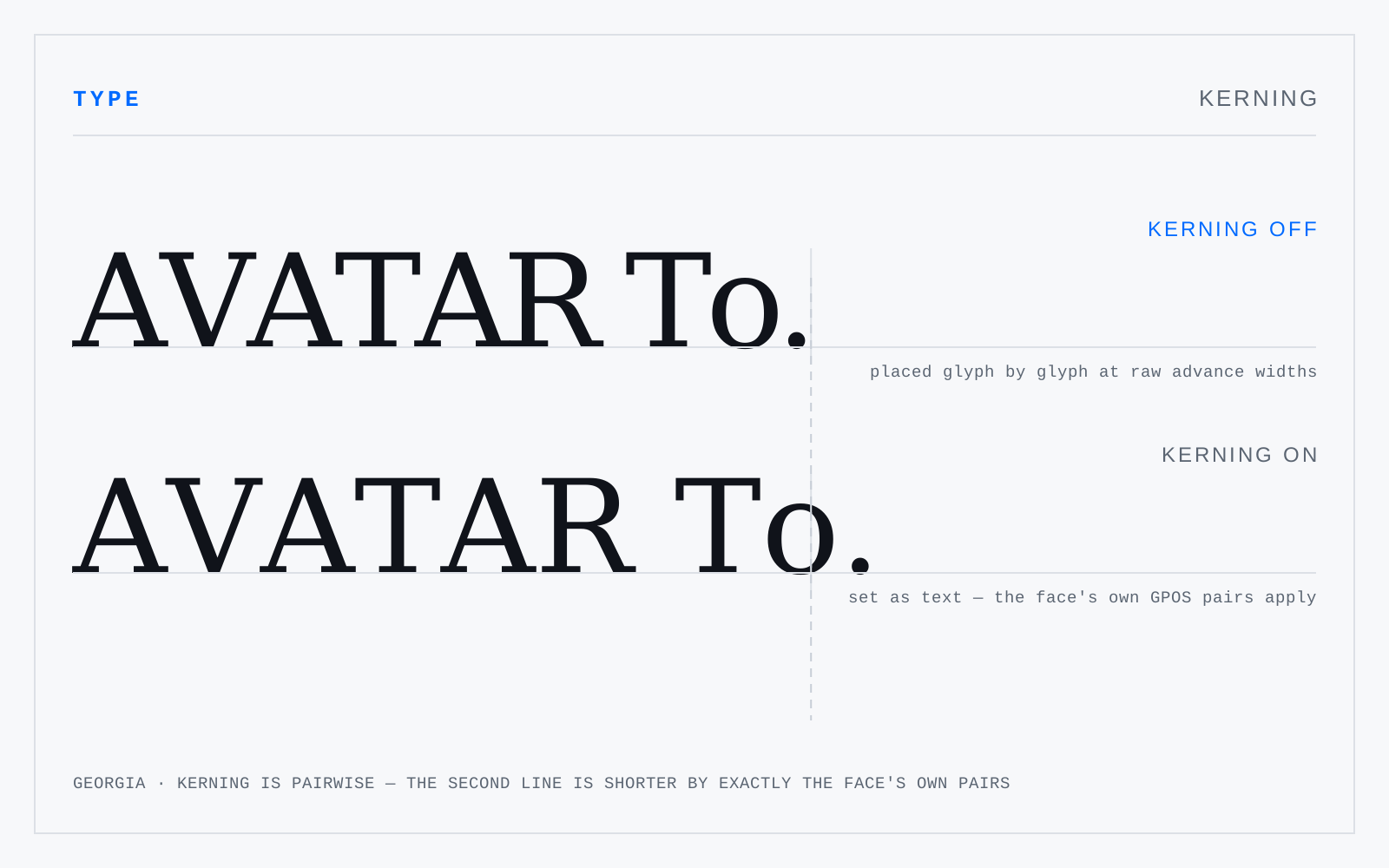
In practice
The single most abused word in the vocabulary. If you're changing the space across a whole run, that's tracking. Kerning is pairwise, and always pairwise.
Not to be confused with
- TrackingA uniform adjustment to the space after every glyph in a run — CSS letter-spacing. Size-dependent: display type usually wants negative tracking because the sidebearings were fitted for text, while small caps, all-caps runs and small labels want positive. Body text at text size almost never wants any.
- SidebearingThe space built into a glyph on either side of its outline. Left sidebearing plus the outline's width plus right sidebearing gives the advance width — how far the pen moves before the next glyph. Sidebearings are the font's own spacing; kerning is the per-pair correction applied on top of them.
Origin
From the kern of metal type: the part of a letter overhanging its own body onto the neighbour's. Kerned sorts were fragile, so kerning was rationed.