Design Nomenclature / Type
Humanist serif
Also called Venetian, humane
- Type
- 2D
This entry has not been translated yet and is shown in English.
The first roman types, cut in Venice from the 1470s and revived since — Jenson, Centaur, Adobe Jenson. Marked by low stroke contrast, strongly inclined stress, sturdy bracketed serifs, a small x-height and, decisively, a slanted bar on the lowercase e. Their model is the humanist hand, not the broadside.
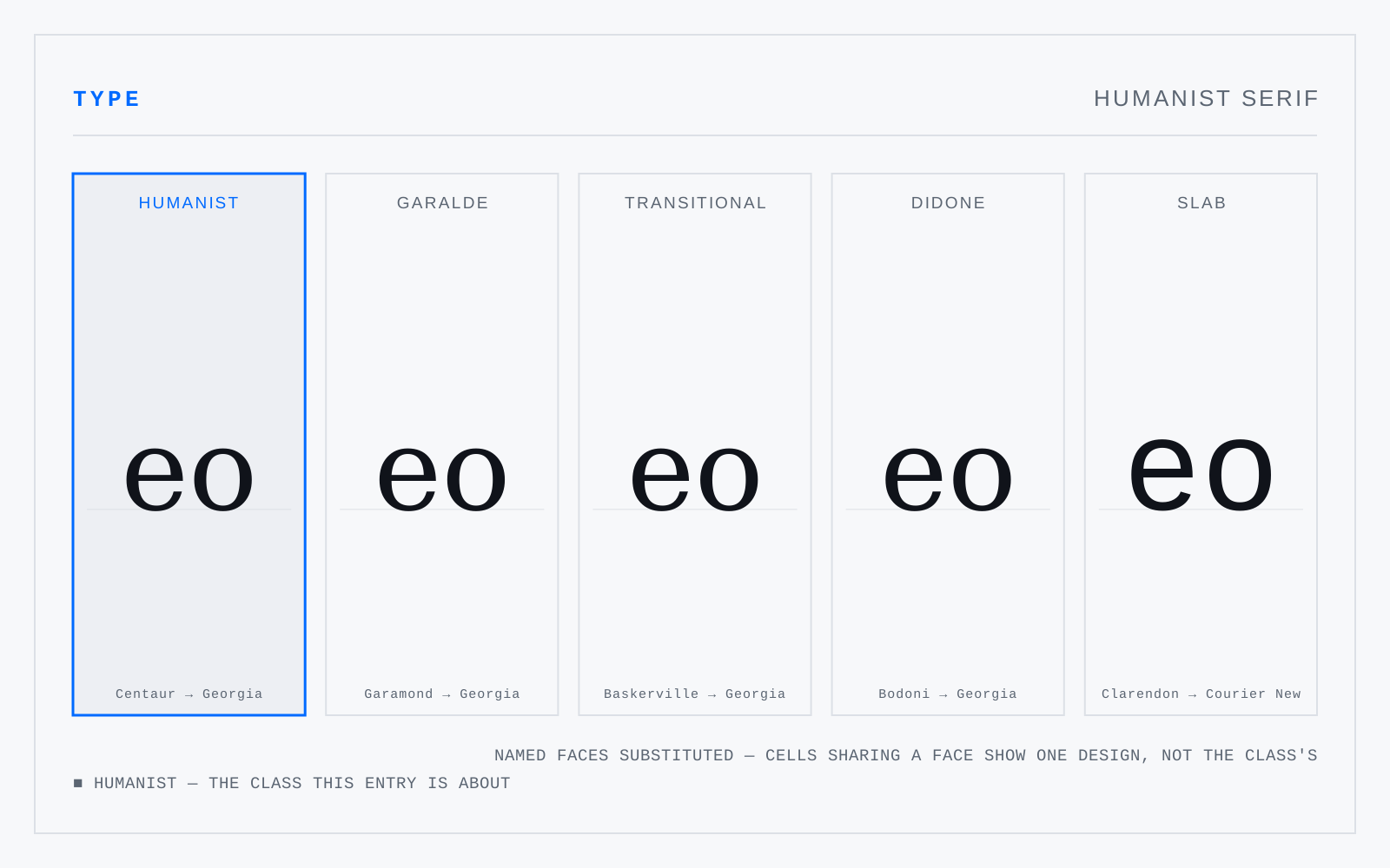
Not to be confused with
- GaraldeThe dominant text roman from roughly 1500 to 1750 — Bembo, Garamond, Granjon, Caslon. Compared to the humanists: more stroke contrast, a level bar on the e, finer bracketed serifs, and stress still inclined but less so. Caslon and Janson sit at its late edge, already reaching toward the transitionals.
- Humanist sansSans serifs drawn on the proportions of the humanist roman rather than on geometry — Gill Sans, Frutiger, Myriad, Source Sans. Varied letter widths, some stroke modulation, a double-storey a and usually g, and open apertures. The class the legibility literature keeps landing on for interfaces and signage.