Design Nomenclature / Systems & Spec
CSS pixel
Also called px, reference pixel, device-independent pixel, dip
This entry has not been translated yet and is shown in English.
The abstract unit CSS lengths resolve to: an angular reference — about 1/96 inch at arm's length, a visual angle near 0.0213° — rather than a hardware pixel. It maps to device pixels through the device pixel ratio, so one CSS px is two or three physical pixels on most phones, and more again under zoom.
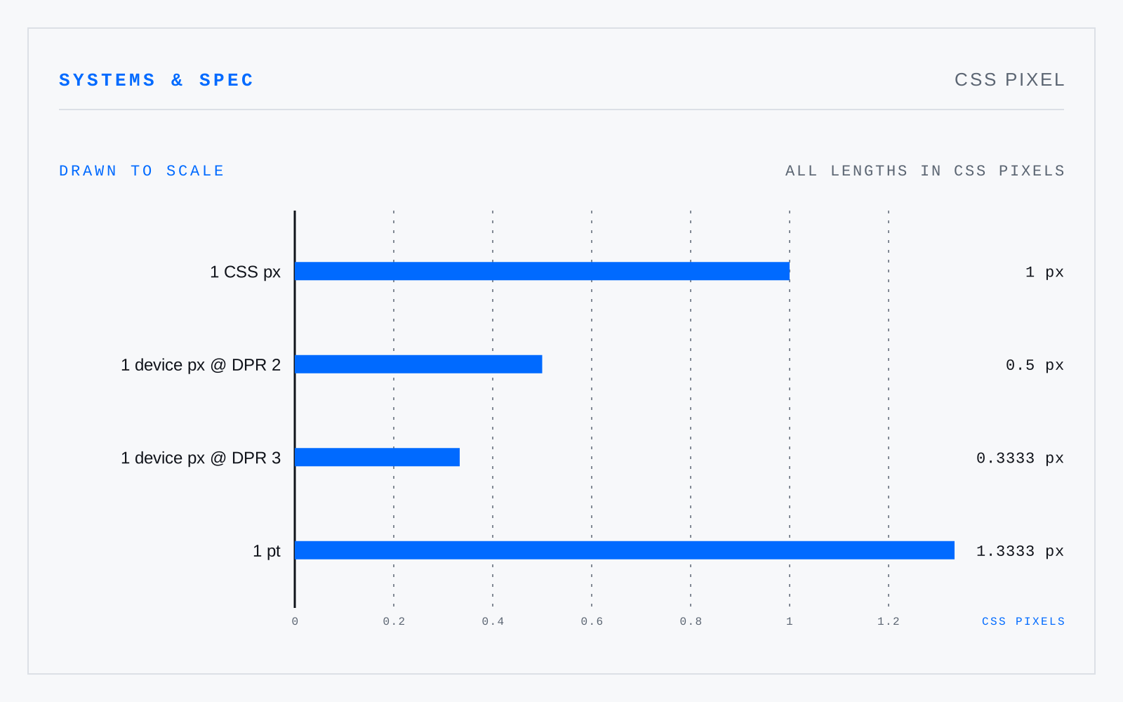
In practice
Assumed to be a screen pixel, which it hasn't been since about 2010. WCAG's 24×24 target and 320px reflow width are CSS pixels — measured after zoom, not in hardware.
Not to be confused with
- PointThe unit of type size, standardised as exactly 1/72 inch by PostScript and every application since. Historically it was never one thing: the Anglo-American point ran near 1/72.27 inch, the Didot point near 0.376 mm, Fournier's smaller again — which is why old specimens don't convert cleanly to anything.
- RemA CSS length equal to the computed font size of the root element — 16px by default, and whatever the reader has set otherwise. Unlike em it does not compound through nesting, and unlike px it honours a browser font-size preference, which is what makes sizing in rem an accessibility decision rather than a style one.
- DPIDots of ink per inch that a printing device can place. It describes hardware. A platesetter at 2400 dpi renders a 150-line halftone screen; an inkjet lays several dots per image sample. It is a property of an output process, not of a file — a file's dpi tag is only a suggested reproduction size.
- PPIImage samples per inch at a stated reproduction size, or the physical pixel pitch of a display. It describes a relationship between a file and an output, never the file alone: a 300 ppi image is 300 ppi only at the size it was specified for. Print it twice as wide and it is 150.