Design Nomenclature / Type
Ascender
- Type
- 2D
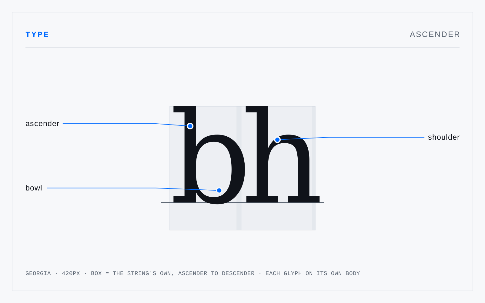
The part of a lowercase letter rising above the mean line — b, d, f, h, k, l, and the upper stroke of t. Ascender length is a design variable rather than a fixed quantity: long ascenders read as classical and demand more leading; short ones buy a larger x-height on the same body.
Not to be confused with
- Cap heightThe distance from the baseline to the top of a flat-topped capital such as H or E. Round capitals like O and S overshoot it slightly. In most Latin faces the cap height sits a little below the ascender line, which is why a lowercase l typically rises above an adjacent H.
- DescenderThe part of a letter falling below the baseline — g, j, p, q, y, and in many faces the capital J and Q's tail. Descender depth interacts with line spacing directly: shallow descenders let lines pack tighter before ascenders and descenders begin to collide between them.