Design Nomenclature / Type
Baseline
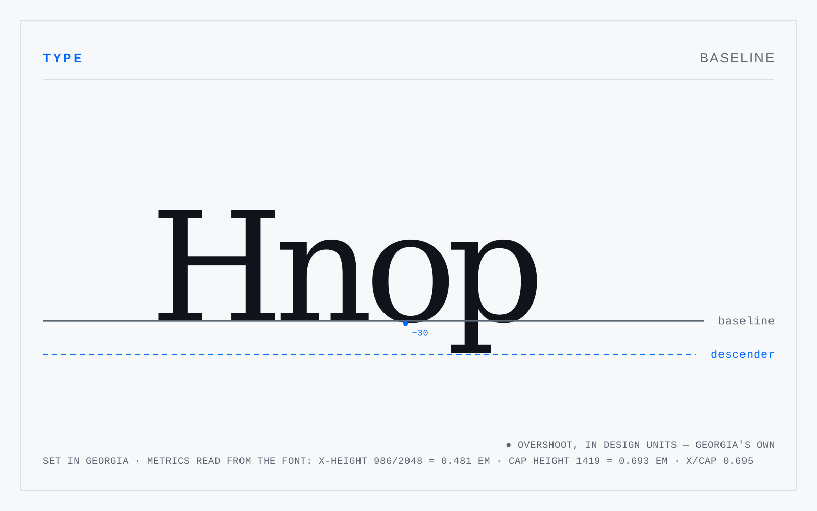
The invisible line on which the flat-bottomed letters of a line of text sit and from which vertical metrics are measured. Round and pointed letters drop below it by design. In digital fonts it is the y-origin of the glyph coordinate system, which makes it the anchor for alignment across mixed sizes and mixed scripts.
In practice
The word implies a bottom edge, which is a Latin habit. Devanagari hangs from a headline; CJK aligns on an em box. Cross-script layout has to choose which baseline wins.
Not to be confused with
- Mean lineThe line touching the tops of the flat lowercase letters — x, v, z — with round letters like o and e overshooting it. The distance from the baseline to it is the x-height. Ascending letters pass through it; the shoulders of n, m and h spring from just below it.
- Baseline gridAn invisible ruling at a fixed interval to which every baseline in a layout snaps, so text in adjacent columns aligns line for line and headings, images and rules land on the same increments. On the web it is enforced by making every vertical measurement a multiple of the body line-height rather than by an actual grid.