Design Nomenclature / Type
Tabular figures
Also called tnum, monospaced figures, proportional figures, pnum
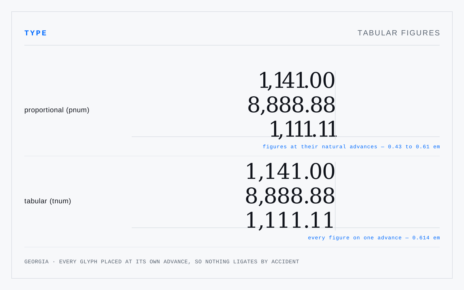
Numerals cast to a single advance width so digits stack in columns and a 1 occupies the same space as a 0 — the OpenType tnum feature, and what any table of figures needs. Proportional figures (pnum) give each digit its natural width, which is better in prose and unusable in a column.
In practice
Also what a live counter or a clock needs: without tnum, the whole readout jitters every time a 1 rolls past. font-variant-numeric: tabular-nums is one line and fixes it.
Not to be confused with
- Oldstyle figuresNumerals with ascenders and descenders — 6 and 8 rise, 3, 4, 5, 7 and 9 drop, the rest sit at x-height. They carry the same rhythm as lowercase, so a date or a page reference stops shouting inside a sentence. The OpenType feature is onum.
- Lining figuresNumerals of uniform height, aligned on the baseline and reaching to cap height or a little below. The default in most faces since the nineteenth century, and the right choice beside capitals, in tables, and in interfaces. Beside lowercase they read as slightly loud, which is what oldstyle figures were kept for.