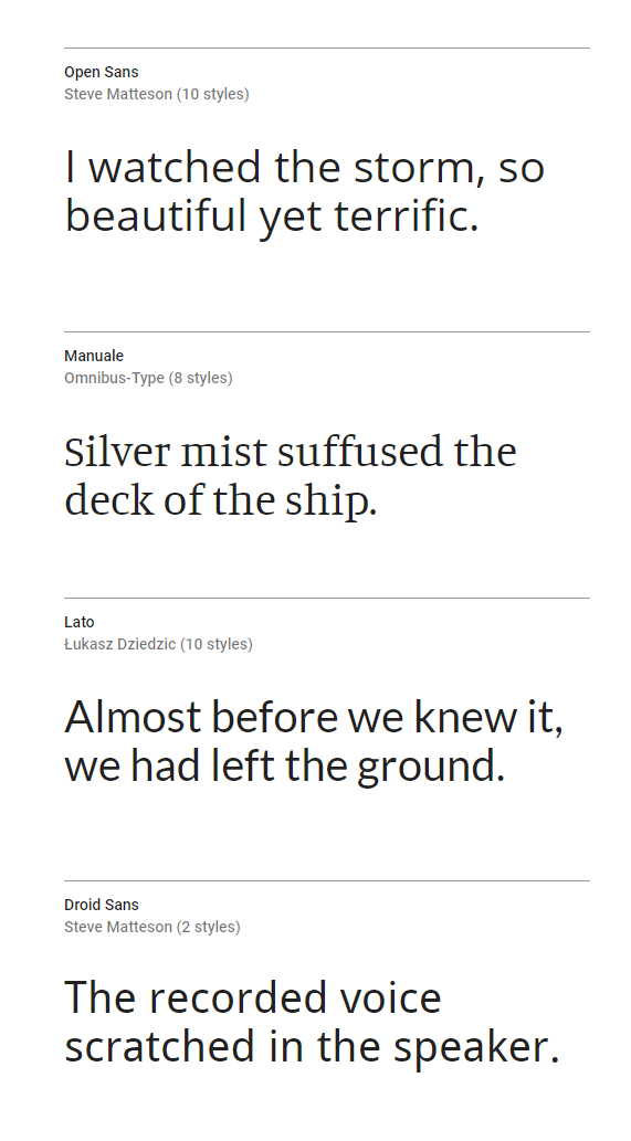
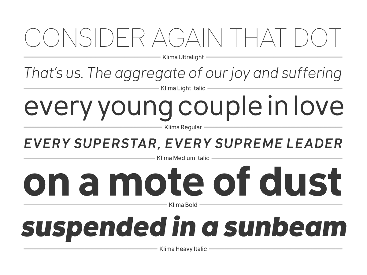
The following typefaces are recommended based on readability criteria established by Boyarski (1998).
Key Readability Criteria
- Good spacing
- Large x-heights
- Open counters
- Medium weight
- Distinct letterforms — a, e, o, c, b, d, p, q, I, l, i, j
- Low contrasting strokes
- Robust serifs
Font Categories
Default Screen Fonts — Many recommendations are standard fonts included on most computers. Downloaded/Embedded Fonts — Non-default typefaces require embedding or downloading. These may require permission from type foundries due to licensing.Downloaded fonts increase the range of design options for designers, representing the technology of the future despite purist objections.
This document excludes fantasy and monospace fonts from consideration.
Original Plates