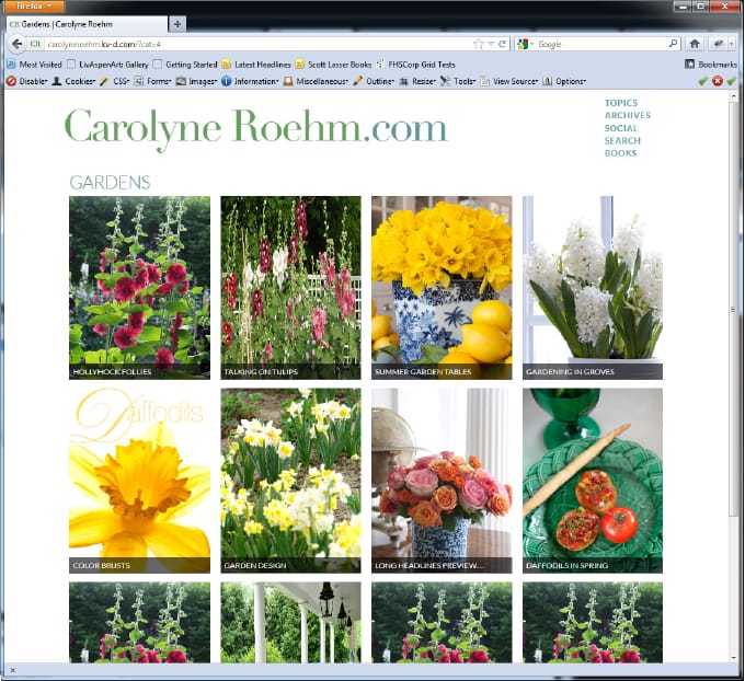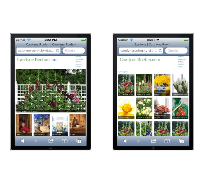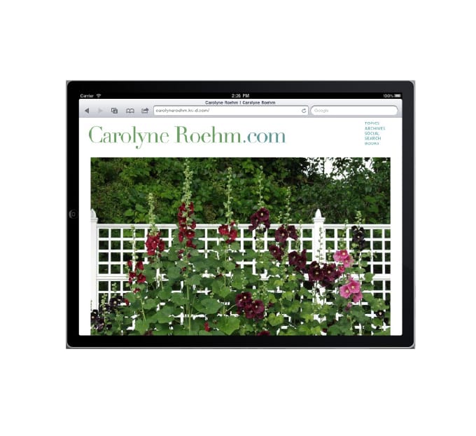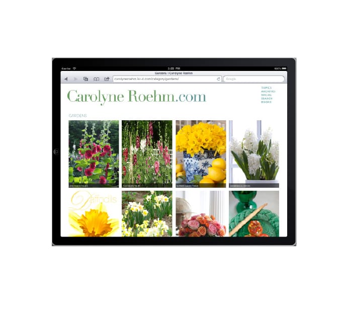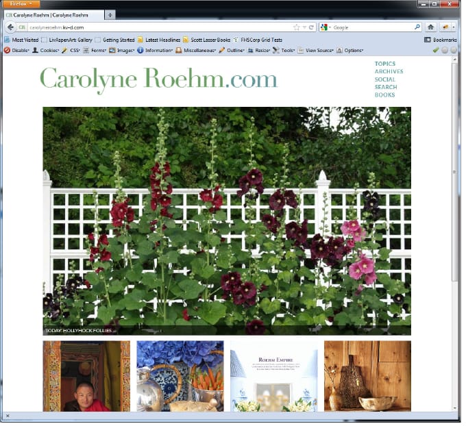
Carolyne Roehm's work — books, gardens, interiors, tabletop design — is photographed at a scale most websites of the era cropped away. The brief was to refuse that compromise: an interface where the photography is the layout, presented as large as each screen allows, from phone to desktop, in the early years of responsive design.
The design keeps chrome to a minimum — quiet typography, generous margins, navigation that gets out of the way — so a reader on any device gets the same experience: the pictures, at full size.