2.2 Kerning and Word Spacing
Kerning is the adjustment of space between two specific characters. The objective of kerning is to create visually equal spaces between all letters so that the eye can move smoothly along the text. Adjustments in kerning are most important in large display and headline text lines. Without kerning adjustments, many letter combinations can look awkward.
A factor of kerning is related to the quality of kerning metrics applied to the font by the designer(s). Some fonts are poorly kerned for the screen.
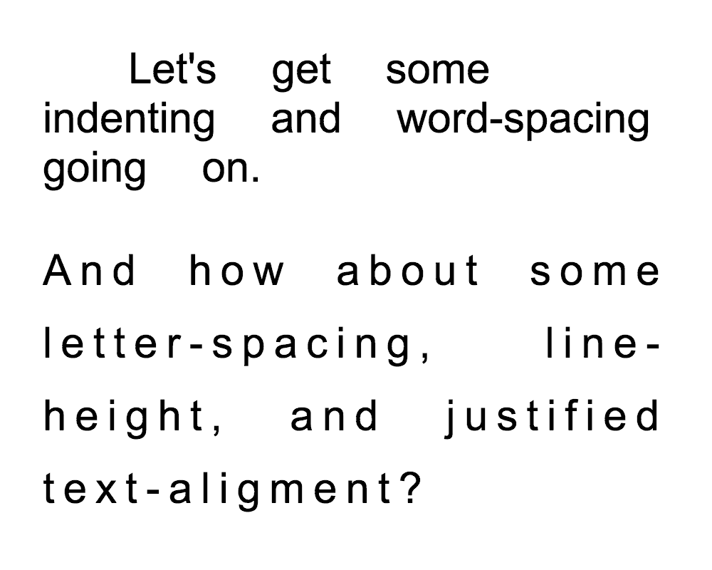
Avoid justified columns of type create irregular spacing of letters which decreases from readability.
