Everything in this publication so far has served the eye. This chapter serves what happens after the eye: comprehension. A page can be flawlessly legible — generous contrast, well-chosen type, comfortable measure — and still fail readers with dyslexia, with cognitive disabilities, with limited literacy, or simply with limited attention in a distracting world. Cognitive accessibility is the least mature area of this field, the hardest to measure, and increasingly where the real gains lie.
It is also an area with more folklore than evidence. Part of this chapter's job is to separate the two.
Plain Language: Typography's Partner
The most powerful cognitive intervention has nothing to do with type: it is writing that says what it means. Short sentences, familiar words, one idea per paragraph, front-loaded conclusions, headings that summarize rather than tease. WCAG acknowledges this in 3.1.5 (Reading Level), a AAA criterion asking that content requiring more than a lower-secondary reading level be accompanied by a simpler version or supplement.
Typography and plain language are partners, not substitutes. Clear structure on the page — honest headings, real lists, short paragraphs with visible space between them — is plain language made visible. A wall of justified gray text announces difficulty before a word is read; a well-articulated page tells the reader where to enter and lets them leave with the point. No typeface rescues convoluted prose, and no prose survives being set as an undifferentiated slab.
Dyslexia: The Honest State of the Evidence
Dyslexia affects a substantial fraction of readers — commonly estimated in the range of five to ten percent or more, depending on definition — and it has attracted well-meaning typographic products, most visibly special "dyslexia fonts" with weighted bottoms and deliberately irregular letterforms, marketed on the theory that they prevent letter rotation and confusion.
The controlled evidence has not been kind to that theory. Studies that measured reading speed and accuracy in dyslexic readers using these fonts against ordinary well-designed typefaces have generally found no significant benefit; where readers were asked, they mostly did not prefer them either. This publication's first edition praised typefaces that clearly differentiate mirror-prone letters — b, d, p, q — and that principle stands; but it is a property of many good ordinary faces, not a licensed cure.
What does measure well is humbler:
- Size and spacing. Larger text, more generous letterspacing, and more interline space show measurable benefit for dyslexic readers in peer-reviewed work — including studies of children whose reading improved with substantially increased letter spacing. Crowding, not letter shape, appears to be a central mechanism.
- Short lines and clear structure. Long lines make regressions — losing one's place and returning — costlier. Dyslexic readers regress more; shorter measures and clear paragraph articulation reduce the cost.
- Ragged-right setting. Full justification stretches and squeezes word spaces, producing uneven rhythm and rivers of white running down the paragraph. Consistent word spacing helps readers who struggle with tracking; left-aligned, ragged-right text provides it. If justification is ever used, it needs hyphenation to tame the spacing — and hyphenation carries its own cognitive tax, splitting words that struggling readers must reassemble. For screen reading, ragged right without hyphenation remains the safest default.
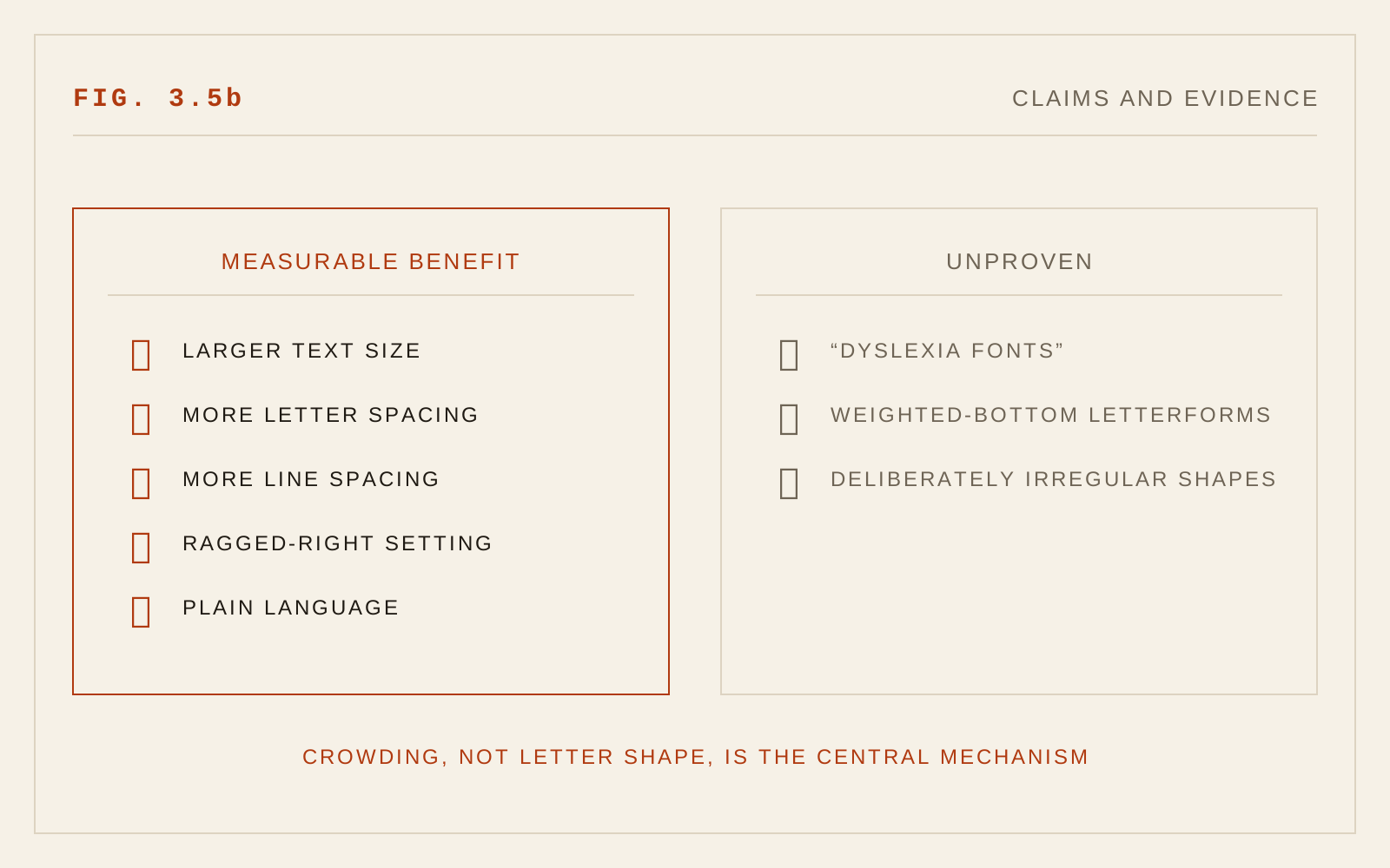
Claims and Evidence
Novel reading aids deserve the same scrutiny. The recent fashion of bolding the first letters of words — marketed as guiding the eye to artificial fixation points and dramatically accelerating reading — has not held up when tested independently: large-scale testing found no meaningful improvement in reading speed, and no credible peer-reviewed support for the dramatic claims exists. The pattern is familiar: a plausible-sounding mechanism, enthusiastic testimonials, and no measured effect.
Reading rulers — bars or tinted strips that track the current line, long used as physical overlays and now offered in some browsers and reading tools — occupy a middle ground: evidence of universal benefit is thin, but some readers with dyslexia or attention difficulties find them genuinely and consistently helpful. That asymmetry points at the correct policy for the whole category: offer such aids as options; never impose them as defaults; and never let a vendor's testimonial substitute for a controlled result when making claims about what a design does.
Personalization: The Real Frontier
The deepest finding running through cognitive accessibility research is variability. Dyslexic readers differ from each other; what helps one reader with attention difficulties does nothing for the next. A single "cognitively optimal" typography does not exist to be found — which redirects the ambition. The designer's job is a well-judged default: plain structure, generous spacing, ragged right, comfortable measure. The system's job, increasingly, is to let readers depart from it: adjust size, spacing, and measure; switch themes; enable a reading ruler; request a simpler version. The technologies of the preceding chapters — variable fonts, user preference media queries, fluid layout that tolerates any text size — are precisely the machinery such personalization needs. The pieces exist; what remains scarce is the will to expose them to readers.
Why This Chapter Is New
The first edition touched cognition only glancingly — a note on a dyslexia-conscious typeface — because in 2005 there was little else to report: the dyslexia-font studies had not been run, WCAG 2.0's reading-level criterion was unpublished, and the personalization machinery did not exist. The intervening years produced both the products and the evidence testing them, and cognitive accessibility grew from an afterthought into an active research field — one whose most useful finding so far is how much of the folklore fails measurement.
In CSS
article {
  max-width: 60ch;      /* shorter measure eases tracking back */
  line-height: 1.5;
  text-align: left;
}
p + p { margin-top: 1.25em; }   /* clear paragraph boundaries */
.long-word-content { hyphens: auto; }
Recommendations
- Write plainly; treat WCAG 3.1.5 as a target for general-audience content, not just a AAA checkbox.
- Make structure visible: honest headings, real lists, short paragraphs, generous spacing.
- Do not deploy special "dyslexia fonts" expecting measured benefit; invest in size, letterspacing, and interline space instead.
- Set body text ragged right; avoid full justification on screen, and avoid hyphenation in body copy.
- Keep measures moderate — long lines punish readers who regress.
- Offer reading aids (rulers, spacing controls, simpler versions) as reader-selectable options, never forced defaults.
- Distrust dramatic readability claims unaccompanied by controlled evidence.