Legibility begins with the letter. Before a reader can recognize a word, the visual system must resolve individual letterforms — and every factor that makes a letter easier or harder to resolve compounds across thousands of fixations in a reading session. The original guidelines identified the decisive factors as type style, weight, slant, width, and spacing. That list survives intact. What has changed is the environment those letters are drawn in, and the control designers now have over each factor.
What Changed Since 2005
The 2005 edition was written for screens where a lowercase letter at body size occupied perhaps nine or ten pixels of height. At that resolution, the pixel grid was the dominant constraint: strokes snapped to whole pixels, fine details vanished or turned to noise, and rendering technology — subpixel antialiasing such as ClearType on Windows, greyscale antialiasing elsewhere — determined as much of a letter's appearance as its designer did. Hinting, the practice of embedding grid-fitting instructions in fonts, was the difference between a usable text face and an unusable one.
High-density displays changed the arithmetic. At two or three device pixels per CSS pixel, the same letter is drawn with four to nine times the pixel budget. Greyscale antialiasing at high DPI renders curves, thin strokes, and true diagonals faithfully; the industry has largely moved away from subpixel rendering because density made it unnecessary. Aggressive hinting matters far less than it did — though it still matters on the standard-density laptop and desktop monitors that remain common, which is why letter-level recommendations cannot yet assume high DPI everywhere.
The second structural change is variable fonts. Weight (wght), width (wdth), optical size (opsz), and in some families grade (GRAD) are now continuous axes addressable from CSS. The original guidelines treated a typeface's weight and width as fixed properties to be selected; they are now parameters to be tuned — including in response to size, background color, and user preference.
The Anatomy That Matters
Research on letter recognition has sharpened since 2005, and it consistently points to a small set of structural features.
X-height remains the single most reliable predictor of apparent size and small-size legibility. Two faces at the same nominal size can differ dramatically in how large they read; the one with the larger x-height reads larger. This is why CSS font-size-adjust exists — it normalizes fallback fonts to a target x-height ratio so that a swap between faces does not silently shrink the text.
Apertures — the openings in letters like c, e, a, and s — govern how easily letters are distinguished from their closed neighbors. Faces with open apertures keep c distinct from o and e distinct from a under low-vision blur or at small rendering sizes; faces with closed, folded-in apertures lose those distinctions first. Legibility-oriented type design over the past two decades has moved decisively toward open apertures, and low-vision research supports the move.
Letter distinction is the third pillar. Confusable pairs — b/d, p/q, and above all the capital I, lowercase l, and figure 1 — are where recognition fails earliest. The original edition pointed to Natascha Frensch's Read Regular as a face designed to differentiate mirror-image letters for dyslexic readers; that design direction has since gone mainstream, and the quick "Il1" test (set the three characters side by side and check that they differ) is now a standard screening step for any interface or body face.
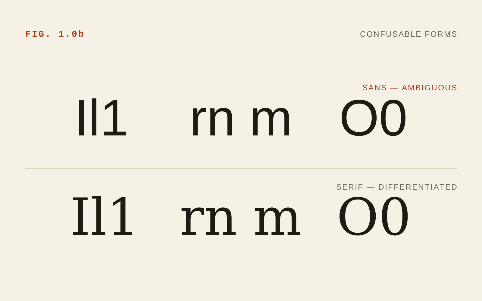
Stroke behavior rounds out the list. Relatively even stroke width, moderate contrast between thick and thin, and moderate overall width all survive from 2005 — extreme modulation and extreme compression both destroy letterforms under blur, which is a fair model of both low vision and low-quality viewing conditions.
Weight, Slant, and Width as Continuous Choices
The original guidance — regular to slightly bold weight, upright rather than slanted, moderate width — holds. The revision is in how those choices are made.
With a variable weight axis, "slightly bold" is no longer a jump from 400 to 700; it can be 450 or 480, enough to thicken strokes for a dark background or a small size without closing counters. Optical size axes, where available, do automatically what type designers once cut separate sizes for: at small sizes the design opens apertures, loosens spacing, and lowers contrast; at large sizes it tightens. Where a face offers opsz, let it apply — browsers do so by default — because it encodes precisely the small-size adjustments this chapter recommends.
Slant remains a legibility cost for continuous text. Italics are for emphasis, not passages; oblique (slanted roman) forms are worse than true italics because they distort letterforms without redesigning them.
Spacing at the Letter Level
The 2005 finding that screen type needs more generous letterspacing and interline spacing than print was, in part, a resolution artifact — loose spacing kept crude pixel letters from fusing. But it was not only that. Crowding research shows that letters packed too tightly impair recognition in peripheral and low-acuity vision, so readers with low vision genuinely benefit from slightly loose settings at small sizes. WCAG 2.2 acknowledges this from the user's side: success criterion 1.4.12 (Text Spacing) requires that content survive user-applied increases to letter, word, and line spacing without loss. Tight tracking as a stylistic signature is fine for display sizes; at text sizes it is a tax on the readers with the least acuity to spare.
In CSS
/* Preserve letterform quality across fallbacks */
body {
  font-family: "Source Sans 3", system-ui, sans-serif;
  font-size-adjust: 0.5;   /* match fallback x-height to the web font */
  font-kerning: normal;
}
Recommendations
- Screen faces by structure, not classification: large x-height, open apertures, even stroke width, moderate width.
- Apply the Il1 test and check b/d/p/q distinction before committing to a text face.
- Use variable font axes deliberately — small weight increments for context, and let optical sizing (opsz) do its work at small sizes.
- Keep continuous text upright; reserve slant for emphasis.
- Set letterspacing neutral-to-slightly-loose at text sizes, and verify layouts survive WCAG 1.4.12 user spacing overrides.
- Test on a standard-density display, not just a high-DPI one; the pixel grid still exists for many readers.