The 2005 edition of these guidelines gave its bluntest instruction here: the screen is a hostile reading environment, so use sans serif typefaces. Serifs, it warned, turn to visual noise at text sizes; fine strokes and nuances do not render. For the displays of that era, the advice was sound. For the displays of this one, it needs to be retired as a rule and replaced with the reasoning that was always underneath it.
What Changed Since 2005
The original recommendation was never really about serifs. It was about pixels. On a 96-DPI panel, a serif two or three physical pixels long either snapped to the grid as a clumsy slab or dissolved into antialiased fog. Thin strokes broke; bracketed curves became stair-steps. Sans serifs designed for the screen — Verdana, Tahoma, and their peers, drawn with sturdy monoline strokes and generous fit — sidestepped all of it. Recommending them was defensive design against a rendering engine that could not draw a serif.
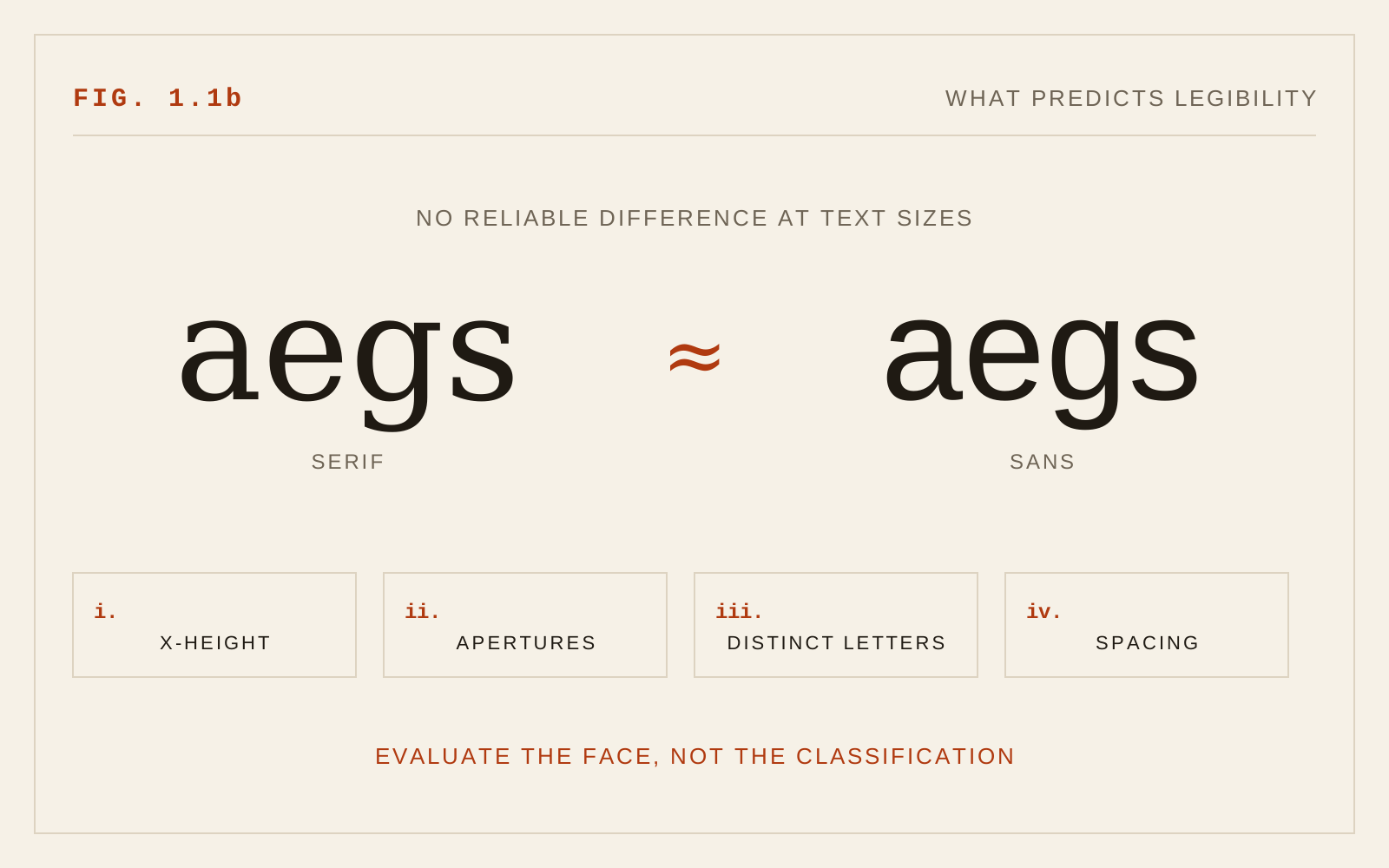
That constraint has substantially dissolved. High-density displays render two to three device pixels per CSS pixel, enough to draw fine serifs, stroke modulation, and subtle joins with fidelity approaching print. Modern greyscale antialiasing at those densities handles curves and diagonals cleanly. On such screens, a well-made text serif and a well-made sans set at the same effective size are both fully legible, and the broader reading research reflects it: when x-height, size, and spacing are controlled, measured differences in reading speed and comprehension between serif and sans styles are small and inconsistent. The serif/sans variable, isolated from everything it used to travel with, explains very little.
Two caveats keep the old rule from being simply inverted. First, standard-density monitors remain common on desks, and on them delicate serifs still degrade — any face chosen for body text should be verified at 1x rendering, where hinting quality and sturdiness of stroke still earn their keep. Second, and more important for this project, the low-vision case is not the average case.
What Actually Predicts Legibility
If style classification is out as the screening criterion, what replaces it is a short structural checklist — the same one introduced in chapter 1.0, applied here to the choice between candidate faces.
X-height first. A face with a large x-height reads larger and survives small sizes better than its nominal size suggests, regardless of whether it carries serifs. Many contemporary text serifs are drawn with x-heights as generous as any screen sans.
Apertures second. Open counters and open apertures in a, c, e, and s preserve letter identity under blur and low acuity. This cuts across classification: there are open, legible serifs and closed, ambiguous sans serifs. The geometric sans genre — much in fashion — is a frequent offender, with near-circular letterforms that converge on one another.
Letter distinction third. Run the Il1 test: set capital I, lowercase l, and figure 1 together. Many popular sans serifs fail it outright, rendering I and l as identical strokes — a genuine hazard in passwords, codes, and names. Serifs, ironically, tend to pass automatically because serifs differentiate exactly these letters. Check b/d and p/q mirroring as well, and the r n pair, which can fuse into m when tightly spaced.
Rendering quality last. A text face intended for interfaces should be tested where it will live: at target sizes, on both high-DPI and standard-density screens, in light and dark modes. Fonts vary in how carefully their files are produced — hinting for low-density rasterization, spacing at small sizes — and this craft dimension matters more than the presence or absence of serifs.
The Low-Vision Nuance
For readers with low vision, the 2005 caution retains real force, in softened form. Low acuity acts like a blur filter, and under blur, fine detail is the first casualty. High-contrast serif designs — those with very thin hairlines and delicate serifs — lose their thin strokes and with them the letter's structure. A sturdy, low-contrast face degrades more gracefully, and most faces meeting that description are sans serifs or slab-adjacent designs. So while the categorical rule is gone, the practical center of gravity for low-vision body text remains a robust, open, evenly weighted face — which will often, though not necessarily, be a sans.
The 2005 warning against ornamental and highly stylized typefaces for continuous text stands without revision. Decorative faces sacrifice letter structure to style, and readers with the least visual headroom pay the highest price. Display use at large sizes is a different, more forgiving context.
One further modern note: claims that particular styles are universally better for dyslexic readers should be treated cautiously. Specialized fonts have not shown consistent objective advantages in controlled studies; the features that do help — letter distinction, generous spacing, adequate size — are available in many well-made faces of any classification, and user-adjustable settings help more than any single font choice.
In CSS
/* Screen for structure, not classification */
body {
  /* Georgia: large x-height, open apertures, screen-hinted */
  font-family: Georgia, Charter, "Bitstream Charter", serif;
}
.ui {
  font-family: system-ui, sans-serif;  /* the platform's proven face */
}
Recommendations
- Retire "sans serif only" as a rule; evaluate candidate faces structurally instead.
- Require a large x-height, open apertures, and even, moderate stroke contrast for body text.
- Apply the Il1 and b/d/p/q tests; reject faces whose letters converge.
- For low-vision-critical contexts, avoid high-contrast designs with fine hairlines; favor sturdy, low-contrast constructions.
- Verify rendering at real sizes on standard-density as well as high-DPI screens, in both light and dark modes.
- Continue to exclude ornamental and highly stylized faces from continuous text.