The 2005 edition answered the size question with a number: a minimum of 14 points, roughly 19 pixels in Verdana, for accessible body text. It was a defensible number for its moment — traditional 9- and 10-point print sizes were plainly unsuitable for coarse screens, and Verdana's enormous x-height made 19 pixels a comfortable read. But the deeper lesson of the past two decades is that no single number can be the answer, because the reader, not the designer, is now the final authority on size. The designer's job has shifted from choosing the right size to building a system that survives the reader's choices.
What Changed Since 2005
Three developments restructured the question.
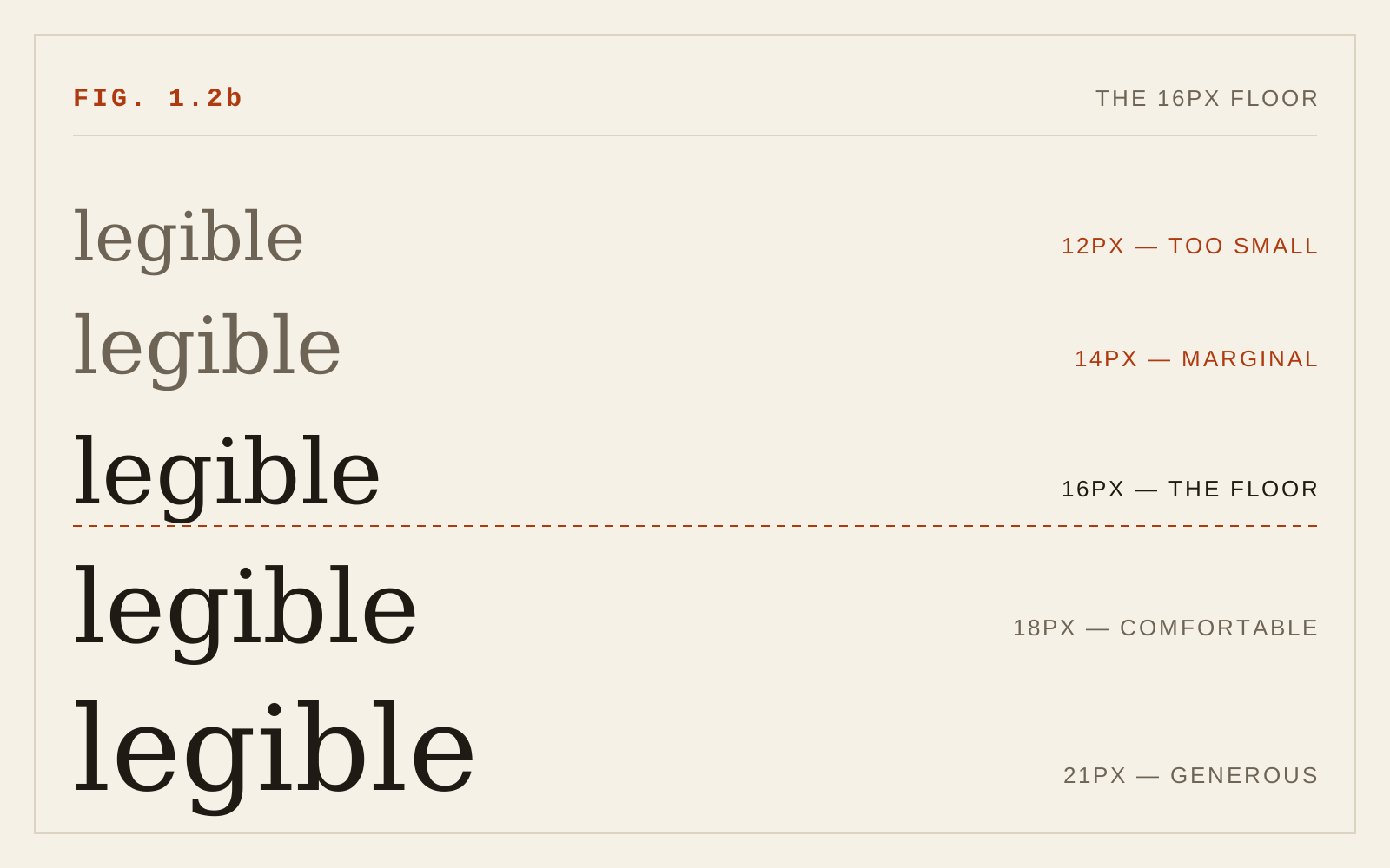
First, the browser default settled the floor. Every major browser ships a default text size of 16 CSS pixels, and users can raise it in settings. Sixteen pixels became the effective contract between platform and reader: body text at the default, or larger, respects that contract; body text below it overrides a preference the user may have deliberately set. The old 19-pixel Verdana figure was compensating for Verdana's outlier x-height and the era's rendering; in a typical modern text face, 16px reads comparably. For faces with small x-heights, 17 or 18px is the honest equivalent — the 2005 insight that x-height matters more than nominal size survives fully intact, and CSS now even encodes it in the font-size-adjust property, which scales fallback fonts to a consistent x-height ratio so a font swap cannot silently shrink the text.
Second, accessibility standards made resizability, not size, the testable requirement. WCAG success criterion 1.4.4 (Resize Text) requires that text can be scaled to 200 percent without loss of content or function; 1.4.10 (Reflow) requires that content reflows at high zoom without two-dimensional scrolling. A page set at a generous fixed size can still fail both; a page set at 16px with resilient layout passes. The standard's center of gravity is the zoom path, not the starting point.
Third, high-density displays removed the old ceiling pressures. Text no longer degrades when scaled, so the 2005 anxieties about layout stability under scaling now have engineering answers rather than typographic ones.
Respecting the User: rem, Not px
The single most consequential practice to adopt is sizing type in rem units. A rem is relative to the root font size, which inherits from the browser default — so a user who raises their default from 16 to 20px sees every rem-sized element scale proportionally. Type fixed in px ignores that preference entirely.
The common defense — "px users can still zoom" — is only partly true, and the distinction matters. Full-page zoom scales px text, yes. But browser text-size settings, which many low-vision users rely on precisely because they persist across every site without per-page fiddling, do not affect px-sized text at all. Fixing type in pixels quietly disables the platform's most durable accessibility mechanism. The same logic argues against setting the root element's font-size to a px value (the old "html { font-size: 62.5% }" trick is acceptable because it is proportional; "html { font-size: 10px }" is not).
Line-height belongs in the same discipline: specify it unitless (1.5 for body text is a sound default) so it scales with whatever size the text ends up at, rather than freezing at a px value computed for the designer's viewport.
Fluid Sizing Without Losing the Floor
Responsive design added a new tool and a new failure mode. The clamp() function lets a size breathe with the viewport — clamp(1rem, 0.9rem + 0.5vw, 1.25rem) sets a floor, a fluid middle, and a ceiling — which is genuinely useful for headings and for body text that should grow on large screens.
The failure mode is viewport-only sizing. Text sized purely in vw units does not respond to zoom: as the user zooms, the viewport's CSS width shrinks proportionally and the text re-computes to roughly the same apparent size, defeating WCAG 1.4.4. The defense is built into the recommended pattern: always include a rem term in the fluid expression and a rem-based minimum in clamp(), so both user preference and zoom retain their grip. Then verify by actually zooming to 200 percent and confirming the text got twice as large.
A Modern Size Architecture
Putting the pieces together, a defensible type scale for accessible reading looks like this: body text at 1rem minimum (16px at default settings, more for small-x-height faces), secondary text no lower than about 0.875rem and never for sustained reading, headings on a modest ratio scale expressed in rem with optional clamp() fluidity, and every fixed px font-size treated as a defect. The 2005 guidance on small text holds in updated form — genuinely small type is tolerable only for short ancillary strings, never continuous passages, and WCAG's contrast rules tighten for it: text below 18pt regular (or 14pt bold) requires a 4.5:1 contrast ratio rather than the 3:1 allowed for large text, an explicit acknowledgment that size and contrast trade against each other.
For readers with low vision, none of this replaces magnification; it makes magnification work. The measure of success is not how the page looks at 100 percent, but whether it remains a single readable column at 200 and 400 percent zoom.
In CSS
html { font-size: 100%; }    /* the reader's choice is the unit */
body { font-size: 1rem; }    /* 16px floor for continuous text */
h1 {
  /* the rem term keeps user settings and zoom in charge */
  font-size: clamp(2rem, 1.2rem + 3vw, 4rem);
}
small { font-size: 0.875rem; }   /* captions only, never body text */
Recommendations
- Treat 16px (1rem) as the floor for body text; raise it for faces with small x-heights.
- Size all type in rem; specify line-height unitless (around 1.5 for body text).
- Never fix body text in px, and never set the root font-size to a px value.
- Use clamp() for fluid type, always with a rem component so zoom and user preferences still apply.
- Use font-size-adjust so fallback fonts hold the intended x-height.
- Test at 200 percent zoom (WCAG 1.4.4) and 400 percent reflow (WCAG 1.4.10) as routine QA.
- Reserve sub-body sizes for short ancillary text, and give small text the stricter 4.5:1 contrast it requires.