The 2005 guidance on weight was compact and correct: set text in regular to slightly bold weights; avoid thin faces, whose strokes carry too little contrast for low-vision readers, and avoid heavy-to-black faces, whose closed counters choke legibility for everyone. Twenty years on, the target has not moved. What has changed is everything around it — weight is now a continuous variable rather than a menu of two or three cuts, dark interfaces have made weight context-dependent, and fashion has spent much of the intervening period pulling interface typography in exactly the direction this chapter warns against.
What Changed Since 2005
In 2005, weight was a discrete choice. A family shipped as regular and bold, perhaps light and black, and the designer picked one. Variable fonts dissolved that constraint: the wght axis exposes weight as a continuum, typically from 100 to 900, addressable from CSS with font-weight or font-variation-settings. "Regular to slightly bold" is no longer a lurch from 400 to 700 — it can be 430 for body text in light mode, 380 on a dark background, 500 for a small label that needs reinforcement. The recommendation survives; the precision with which it can be executed is new.
Some families go further and expose a grade axis (GRAD), a convention popularized by families such as Google's Roboto Flex. Grade changes stroke thickness without changing letter widths, so adjusting it does not reflow the text. That distinction matters wherever weight must respond to context — dark mode, hover states, rendering differences — without shifting layout.
The second change is the rise of dark interfaces as a first-class mode, queryable via prefers-color-scheme. Weight and polarity interact, and the 2005 guidelines — written in an era of near-universal dark-on-light text — never had to address it.
Dark Mode and Weight Compensation
Light text on a dark ground reads heavier than the same text in positive polarity. Bright strokes appear to swell against dark surroundings — the effect is commonly described through halation, the spreading of light from bright areas, and it is pronounced on emissive screens and for readers with astigmatism or scattered-light conditions. A face tuned to look right in dark-on-light will look slightly inflated and blurred in light-on-dark; counters tighten, and at small sizes letters begin to clog.
The practical compensation is to reduce weight slightly in dark mode. With a variable wght axis, dropping body text on the order of 20 to 50 units — from 400 toward 370, say — restores the intended stroke density. Where a GRAD axis exists, it is the better tool, since a negative grade thins strokes with no reflow; this is precisely the use case grades were designed for. Static families offer no good lever, which is itself an argument for variable fonts in any product committed to both color schemes.
Dark mode carries a second, related adjustment: pure white text on pure black maximizes halation. Slightly softened foregrounds (off-white) and elevated dark surfaces reduce the glare without meaningfully sacrificing contrast. Weight compensation and value softening work together.
The Thin-Weight Problem
The strongest revision this chapter makes is not to the rule but to its urgency. In 2005, thin type was rare because it could not render — a hairline stroke on a 96-DPI screen simply disappeared. High-density displays made ultra-light weights renderable, and fashion followed immediately: thin and extralight weights became shorthand for elegance and modernity in branding, interfaces, and large display text.
Renderable is not readable. A 200-weight stroke that survives on the designer's high-DPI screen degrades on standard-density monitors, dims further under low display brightness or aggressive night-shift filtering, and for low-vision readers may fall below the threshold of useful stroke contrast altogether. Thin type is a stacked bet that every reader has excellent acuity, a premium screen, and full brightness. Measured contrast ratios also overstate thin type's real performance: WCAG's formula compares foreground and background colors but does not account for stroke width, so a 100-weight face can technically pass 4.5:1 while presenting far less usable contrast than a 400-weight face at the same colors. The APCA research feeding the WCAG 3.0 draft addresses exactly this gap — its model treats contrast, size, and weight as interacting variables, assigning thinner and smaller text stricter lightness-contrast requirements. That direction of travel confirms the 2005 instinct: weight is part of contrast, whether or not the current formula says so.
The other pole needs less relitigating. Heavy and black weights still close counters and fuse letterforms at text sizes; they remain display tools. Bold retains its legitimate role as emphasis and hierarchy — and WCAG itself acknowledges bold's contribution by lowering the large-text contrast threshold to 14pt for bold text versus 18pt for regular.
Weight in Practice
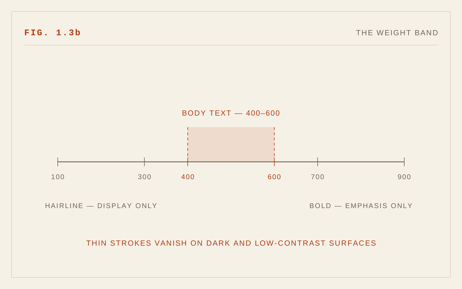
A modern weight policy looks like this. Body text sits between roughly 400 and 500, chosen per family — some faces are drawn light at 400 and read better at 450. Emphasis steps up 200 to 300 units from body weight so it is unmistakable rather than ambiguous. Dark mode subtracts a modest amount via wght or, preferably, GRAD. Nothing below about 300 appears at text sizes, and anything below that at display sizes is checked on a standard-density screen at realistic brightness. Where variable fonts are unavailable, the static cuts nearest these targets apply, and dark-mode compensation shifts to color softening instead.
In CSS
body { font-weight: 400; }
strong { font-weight: 600; }     /* semibold beats bold for emphasis */

@media (prefers-color-scheme: dark) {
  /* light-on-dark reads heavier — pull back with a variable axis */
  body { font-variation-settings: "GRAD" -20; }
}
Recommendations
- Keep body text in the 400–500 range, tuned per typeface with the variable wght axis where available.
- Reduce weight slightly in dark mode; prefer a GRAD axis where the family offers one, since grade changes do not reflow text.
- Soften pure white-on-black pairings in dark mode to limit halation.
- Treat weights below roughly 300 as display-only, and verify them on standard-density screens; never use them for continuous text.
- Avoid heavy-to-black weights at text sizes; use bold as a deliberate emphasis step of 200–300 units above body weight.
- Do not let a passing WCAG contrast ratio excuse thin strokes — weight is part of effective contrast, as the APCA work behind the WCAG 3.0 draft makes explicit.