The original 2005 recommendation was blunt: set continuous text in upright Roman letters, because slanted letterforms are harder for low-vision readers to resolve. Two decades of screen rendering improvements, higher-resolution displays, and better research have refined that advice without overturning it. Upright type remains the correct default for body text. What has changed is our understanding of why, and what to do when slanted type is genuinely useful.
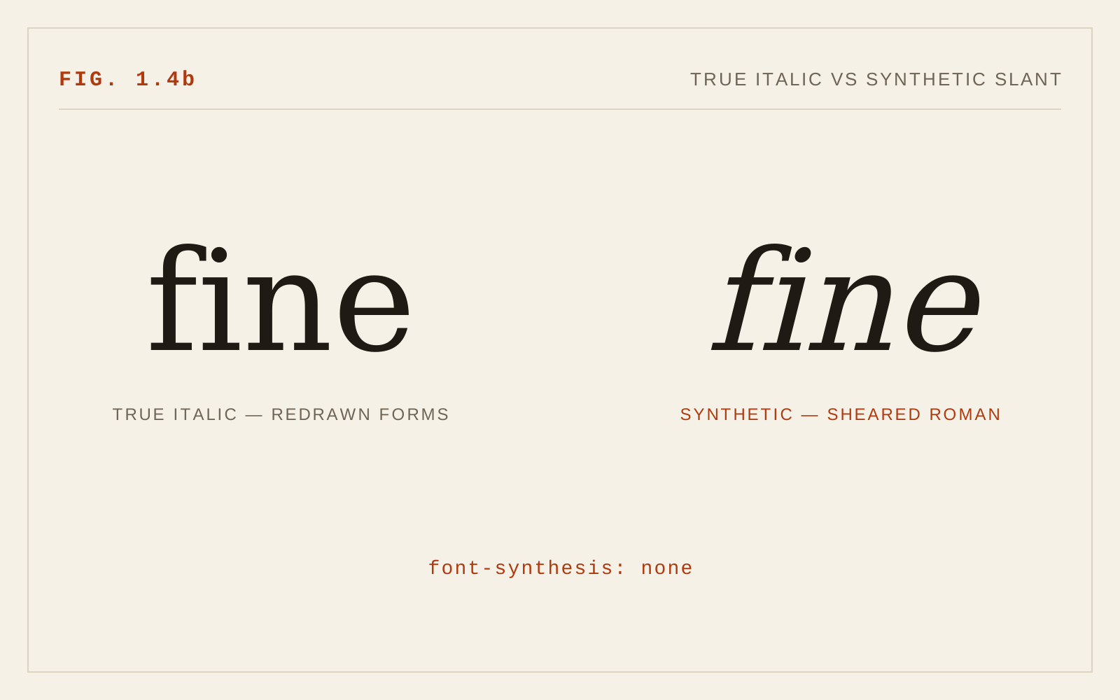
Slant is not a single thing. A true italic is a distinct design — often with different letter constructions (the single-storey a and g, cursive entry and exit strokes, narrower proportions). An oblique is the upright design mechanically or optically slanted. And a synthesized slant is what software fabricates when no italic file is available: the browser shears the Roman glyphs sideways. These three cases have very different legibility profiles, and the 2005 text treated them as one.
What Changed Since 2005
Version 1 recommended avoiding italic entirely and substituting bold for emphasis. That was reasonable advice for 96 DPI screens rendering hinted bitmaps, where slanted strokes aliased into stair-steps and letterforms genuinely fell apart. On modern high-density displays with subpixel and grayscale antialiasing, a well-drawn italic renders cleanly, and the blanket prohibition is no longer justified for short spans.
The current consensus, reflected in guidance from organizations serving low-vision readers, is proportionate: avoid italics for continuous text — paragraphs, long captions, extended quotations — but accept them for their traditional semantic roles: emphasis on a word or phrase, titles of works, foreign terms. The problem was never a few slanted words; it was pages of them.
The other major change is variable fonts. OpenType variations, supported in every major browser since roughly 2018, introduced two registered axes relevant here: slnt (slant), a continuous angle typically expressed in negative degrees, and ital (italic), usually a binary switch between Roman and true-italic constructions. CSS exposes these through the font-style property — font-style: italic should select the ital axis or an italic file, while font-style: oblique 8deg can request a specific slant angle on fonts that support it. This gives designers precise, intentional control that simply did not exist in 2005.
True Italics, Obliques, and Synthetic Slants
The legibility hierarchy is consistent. True italics are drawn as italics: strokes are balanced for the angle, counters stay open, spacing is fitted. Obliques designed by the type designer (common in grotesque sans-serifs) are a step down but still deliberately corrected — curves are redrawn so they do not distort under shear. Synthesized slants are the worst case: naive shearing thins one side of every curve, closes counters, and disturbs spacing. Nothing about the result was ever seen by a designer.
The practical rule: never rely on faux italic. If the typeface you ship has no italic, either load one or do not use italic styling at all. In CSS, font-synthesis: none (or font-synthesis-style: none) disables the browser's fabricated slant so a missing italic degrades to upright rather than to a distorted shear. Audit your font loading — a surprising number of production sites request italic styles they never actually load, and every one of those spans renders as synthetic slant.
Low-Vision Considerations
The core 2005 observation still holds for readers with reduced acuity, central field loss, or cataract-related blur: slanted letterforms present less familiar shapes, tighter apparent spacing, and — in cursive-flavored italics — letter constructions that differ from the Roman a reader has practiced on. WCAG does not prohibit italics, but guidance associated with low-vision user needs consistently advises limiting them, and readers who magnify text report that italic degrades faster under blur than the upright equivalent.
Bold remains a strong emphasis alternative and is often the better choice when the emphasized content is functionally important — warnings, key terms, actionable phrases — because weight change survives blur and low contrast better than slant change. But bold and italic are not interchangeable semantically. Italic whispers; bold shouts. A page that uses bold for every emphasis reads as if it is shouting throughout. A sensible pattern: bold for information the reader must not miss, italic for conventional typographic emphasis, and neither for more than a phrase at a time.
Two further cautions. First, avoid italic at small sizes — below roughly 14 pixels the angle plus reduced counters compound quickly. Second, avoid pairing italic with other legibility reductions: italic plus all caps, italic plus light weights, italic plus low contrast. Each degradation is survivable alone; stacked, they are not.
Variable Axes in Practice
Where a variable font offers a slnt axis, resist the temptation to use intermediate angles decoratively in text. A gentle 4-degree slant on a heading is a legitimate stylistic device; body copy at arbitrary slant angles is not. If you animate slant (some interfaces do, for hover states or emphasis transitions), respect prefers-reduced-motion — morphing letterforms are motion, and vestibular-sensitive readers experience them as such.
Check, too, that your variable font's italic behavior matches your CSS. Some families ship slnt-only variables where font-style: italic produces nothing or the wrong instance; explicit font-variation-settings or a proper font-face declaration with font-style: oblique 0deg 10deg ranges resolves the ambiguity.
In CSS
em, cite { font-style: italic; }   /* short spans only */

/* Never let the browser fake an italic the family lacks */
body { font-synthesis-style: none; }

/* Variable slant, when the family offers the axis */
.aside { font-variation-settings: "slnt" -6; }
Recommendations
- Set all continuous text upright; the 2005 finding stands.
- Allow true italics for short emphasis spans, titles, and foreign terms — a phrase, not a paragraph.
- Prefer bold over italic when the emphasized content is functionally critical.
- Never ship synthetic slants: load a real italic file or set font-synthesis-style: none.
- Prefer typefaces whose italic is a corrected design, not a raw shear.
- Avoid italic below about 14px, and never stack italic with all caps, light weights, or low contrast.
- With variable fonts, use the ital axis or a proper italic instance for semantics; treat the slnt axis as a display device, and respect prefers-reduced-motion if you animate it.