Width is the quietest of the type axes. Readers rarely notice it consciously, yet it governs the two resources legibility depends on: the counter space inside letters and the number of characters that fit on a line. The 2005 finding was that regular to slightly condensed widths are the most legible — extended faces spread letterforms past easy recognition, and heavily condensed faces choke the counters that distinguish an e from a c or an o. That finding has aged well. What has changed is the machinery: width is no longer a fixed property of a font file but a continuous, scriptable design axis.
What Changed Since 2005
In 2005 a "condensed" font was a separate file, if it existed at all, and web designers mostly had neither the fonts nor the delivery mechanism to use one. Two developments transformed this. Web font delivery (the modern @font-face era, from about 2010) made real condensed and extended cuts available. Then OpenType variable fonts (2016 onward) registered wdth as a standard axis, exposed in CSS through font-stretch — now formally aliased as font-width — with keyword values like condensed (75%) and semi-condensed (87.5%), or arbitrary percentages on fonts that support the range.
The critical property of a designed width axis is that it is not scaling. As a variable font narrows along wdth, the designer's interpolation keeps vertical stroke weights consistent, holds counters as open as the geometry allows, and refits spacing. Horizontal scaling — transform: scaleX(0.8) or its ancestors — does the opposite: it thins vertical strokes relative to horizontals, distorts curves, and compresses spacing proportionally. The distinction between a true condensed and a faux-condensed is exactly the distinction between a true italic and a sheared Roman, and it matters for the same low-vision readers.
The second change is conceptual. Responsive design taught us that line length, not font choice, is the variable users actually experience — and width is now a tool for managing it. A headline that wraps awkwardly at narrow viewports can tighten a few width units instead of shrinking below readable size. This is a genuinely new capability, and it comes with genuinely new ways to go wrong.
Width and the Counter Budget
The legibility mechanics from Version 1 still describe the trade-off correctly. Extended widths enlarge letterforms horizontally without adding distinguishing information; at reading sizes they slow recognition slightly and waste measure. Strongly condensed widths close counters and reduce the spatial differences between confusable pairs — in a tight condensed, o, e, and c converge, and the rhythm of verticals in words like minimum becomes a picket fence.
For continuous text, the safe band remains narrow: roughly 90% to 100% of normal width — normal down to just shy of semi-condensed. Condensed and narrower cuts are display tools — headlines, labels, data-dense tables where a designed condensed genuinely outperforms a shrunken regular. Extended widths are branding tools. Neither belongs in paragraphs.
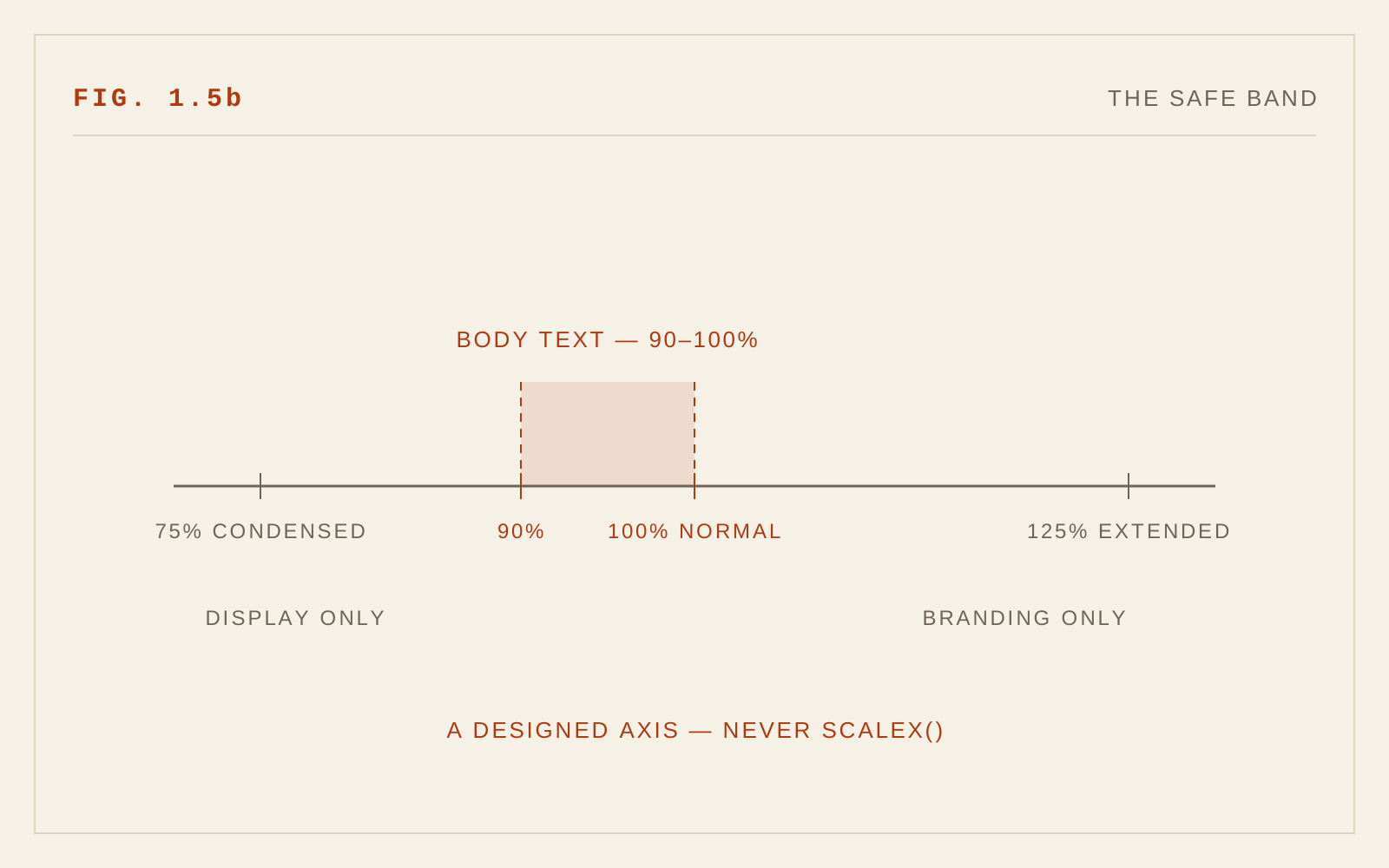
Weight interacts with width. Condensing a bold face closes counters twice over; if you must condense, stay at regular weight or lighter. Size interacts too: whatever width works at 40px headline size needs relaxing at 16px body size. Some variable fonts pair wdth with an optical size axis (opsz) that partially manages this; most leave it to you.
Zoom, Magnification, and Low Vision
The population that most needs generous widths is the population most likely to encounter condensed type in the worst conditions. Screen magnifier users see a small window onto an enlarged page: condensed type magnified reveals its closed counters and tight fit without the compensating context of the full line. Readers using browser zoom at 200% — a level WCAG 2.2's Resize Text criterion (1.4.4) requires content to survive — will trigger your narrow-viewport layouts, which is precisely where designers are now tempted to condense type to make things fit.
Resist that temptation for body text. If a layout only works at 200% zoom by squeezing letterforms, the layout is the problem. WCAG 1.4.10 (Reflow) points the right direction: content should reflow into a single column rather than compress. Width adjustment is legitimate for headlines under reflow; it is a red flag when applied to paragraphs.
Text-spacing adaptations matter here as well. WCAG 1.4.12 requires that user-applied increases to letter and word spacing not break content. Condensed type that depends on tight fit tends to fall apart visually when a low-vision user adds letter-spacing — another reason to keep continuous text near normal width, where added tracking degrades gracefully.
Avoiding Faux-Condensed
Faux-condensing survives in the wild in three forms: CSS transforms on text, legacy font-stretch applied to fonts with no width axis (which browsers correctly ignore, but designers sometimes "fix" with transforms), and SVG or canvas text scaled non-uniformly. All three produce the thinned-verticals distortion no type designer approved. If a design genuinely needs narrower type, the options are: a variable font with a real wdth axis, a separate designed condensed cut, or a different layout. There is no fourth option that respects the reader.
When you do use the wdth axis, prefer the high-level font-stretch/font-width property over raw font-variation-settings so the browser can manage inheritance and fallback sensibly, and verify the fallback: on systems where the variable font fails to load, a condensed request against a fallback stack should degrade to normal width, not to a synthesized squeeze.
In CSS
/* Width belongs to the wdth axis — never to transforms */
body { font-stretch: 100%; }
.compact-table { font-stretch: 92%; }   /* slightly condensed floor */

/* Anti-pattern — distorts stroke contrast and spacing:
   .squeezed { transform: scaleX(0.8); } */
Recommendations
- Keep continuous text between roughly 90% and 100% of normal width; the 2005 finding stands.
- Reserve designed condensed cuts for headlines, labels, and space-critical display settings; reserve extended cuts for branding.
- Never fake width: no scaleX transforms, no non-uniform scaling of text in SVG or canvas.
- Use the variable wdth axis via font-stretch (font-width), and confirm graceful fallback when the font fails to load.
- Do not condense body text to survive 200% zoom or narrow viewports — reflow instead, per WCAG 1.4.10.
- Verify text remains intact when users increase letter and word spacing (WCAG 1.4.12); tight condensed settings often fail this first.
- Avoid combining condensed width with bold weight or small sizes; the counter budget does not stretch that far.