The 2005 edition of this chapter did what every guide of its era did: it named names. Verdana, Georgia, and their cohort — the Microsoft core web fonts commissioned for the screen — were the defensible recommendations when designers could rely only on fonts preinstalled on users' machines. Twenty years later the constraint is gone. Web fonts load reliably, variable fonts are mainstream, and the catalog of available typefaces has grown from a dozen to tens of thousands. Naming a shortlist is no longer useful. Teaching the criteria is.
That shift is also more honest. The old shortlist was good not because those fonts were magic but because they embodied specific, checkable properties: generous x-heights, open apertures, loose fit, and letterforms drawn to survive coarse rendering. Those properties — largely the Boyarski-era criteria the original chapter cited — remain the right test, and they can be applied to any candidate typeface in minutes.
What Changed Since 2005
Three things. First, the delivery problem dissolved: @font-face and WOFF2 compression made shipping a chosen typeface routine, so "default screen fonts" and "embedded fonts" are no longer meaningfully different categories, and the licensing anxiety the original chapter flagged has been largely absorbed by web-licensing norms and open-source type.
Second, a genre of purpose-built "accessible typefaces" emerged. Some are serious efforts: Atkinson Hyperlegible, commissioned by the Braille Institute, exaggerates distinctions between commonly confused characters for low-vision readers. Lexend was designed around the hypothesis that wider spacing and specific proportions improve reading fluency. APHont was developed by the American Printing House for the Blind for low-vision print and screen use. Luciole was designed in France specifically for visually impaired readers. These are real projects by people who studied the problem.
Third — and this is the necessary caveat — the evidence base has not kept pace with the marketing. Independent studies of reading speed and comprehension generally find that individual differences between readers swamp differences between reasonable typefaces, and that familiarity is itself a legibility factor. The much-publicized claims around dyslexia-specific fonts, in particular, have repeatedly failed to replicate in controlled studies: readers with dyslexia in such studies generally read no faster in specialty dyslexia fonts than in ordinary well-spaced type, and often prefer familiar faces. "Designed for accessibility" is a design intention, not an outcome guarantee. Choose on visible, checkable properties, not on the label.
The Criteria That Matter
The Version 1 list holds up remarkably well; here it is, updated and made testable.
- Character distinction. Type the string Il1, then 0O, then rn beside m, then cl beside d. Uppercase I, lowercase l, and the digit 1 must be distinguishable at a glance — via serifs, a tailed l, or a flat-topped 1. This is the single fastest disqualifier, and many popular geometric sans-serifs fail it.
- Open apertures. The openings in a, c, e, and s should be wide. Closed apertures make e collapse toward o under blur, small size, or low vision.
- Generous x-height, within reason. A large x-height enlarges the part of the letter carrying most identity. Extremes backfire: when x-height crowds the ascenders, h and n begin to converge, and d and a lose separation.
- Comfortable fit. Spacing that is slightly loose at text sizes beats spacing that is fashionably tight. Also verify the face tolerates user-applied letter-spacing increases (WCAG 1.4.12) without falling apart.
- Moderate stroke contrast and sturdy joins. High-contrast moderns shed their thin strokes at small sizes and low resolutions. Medium, monotone-ish weights render dependably.
- Two-storey a, distinguishable g, unambiguous forms. Letterforms should differ by construction, not just by nuance. Mirrored pairs (b/d, p/q) benefit from asymmetric details.
- A real italic and a usable bold. Per chapters 1.3 and 1.4, you will need honest emphasis styles; a family without them forces synthesis.
System Stacks and the Familiarity Dividend
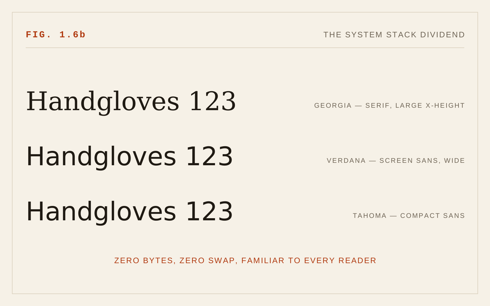
The modern system font stack — San Francisco on Apple platforms, Segoe UI on Windows, Roboto on Android, rendered via font-family: system-ui — deserves specific praise. These faces were engineered for their platforms' rendering, ship with full weight ranges and true italics, cost nothing to load (a performance win that is itself an accessibility win on slow connections), and are the faces readers see all day. Familiarity is measurable legibility capital. A system stack is never the exciting choice, but for application UI and utilitarian text it is close to unimpeachable.
For editorial voice, the honest position is that many ordinary, well-made text faces — humanist sans-serifs and sturdy text serifs alike — satisfy every criterion above. The accessibility-focused faces named earlier are reasonable candidates too, particularly Atkinson Hyperlegible where low-vision readers are a primary audience. What matters is that the choice be tested against the criteria and against your actual rendering targets, at your actual sizes.
In CSS
/* Criteria first, then names: distinct Il1/0O, open apertures */
body {
  font-family: "Atkinson Hyperlegible", Seravek, Verdana,
    system-ui, sans-serif;
  font-size-adjust: 0.53;   /* keep fallback x-heights consistent */
}
Recommendations
- Choose by criteria, not by name or by "accessible" branding: test Il1, 0O, rn/m, aperture openness, and fit yourself.
- Treat specialty accessibility fonts as candidates that must pass the same tests — several (Atkinson Hyperlegible, Lexend, APHont, Luciole) are credible; none is a silver bullet.
- Be skeptical of dyslexia-font claims; controlled studies have not supported reading-speed benefits, and well-spaced ordinary type performs comparably.
- Serif versus sans-serif is not the question; construction quality is.
- Use system font stacks confidently for UI and utilitarian text — familiarity and rendering quality are real advantages.
- Require a true italic and at least one solid bold in any family you adopt.
- Verify your choice survives WCAG text-spacing adjustments, 200% zoom, and your smallest production size before committing.
- Retest when the typeface, the rendering environment, or the audience changes — the criteria are stable, but the passing list is not.