Section 1.0 dealt with legibility — whether individual letterforms can be resolved. This section moves up a level, to readability: whether words, lines, and passages can be read with ease, speed, and comprehension. The distinction matters because a page can pass every letterform test and still exhaust its reader through cramped spacing, marathon lines, flat hierarchy, or prose that hides its point. Legibility is a property of the type; readability is a property of the whole reading experience, and it is where most real-world failures happen.
The 2005 edition organized this territory well — case, spacing, measure, hierarchy, writing quality — and its practical advice needs less revision than its theory does. What has changed most is our picture of the reading process itself, and that picture is worth laying out because it explains why the practical rules work.
What Changed Since 2005
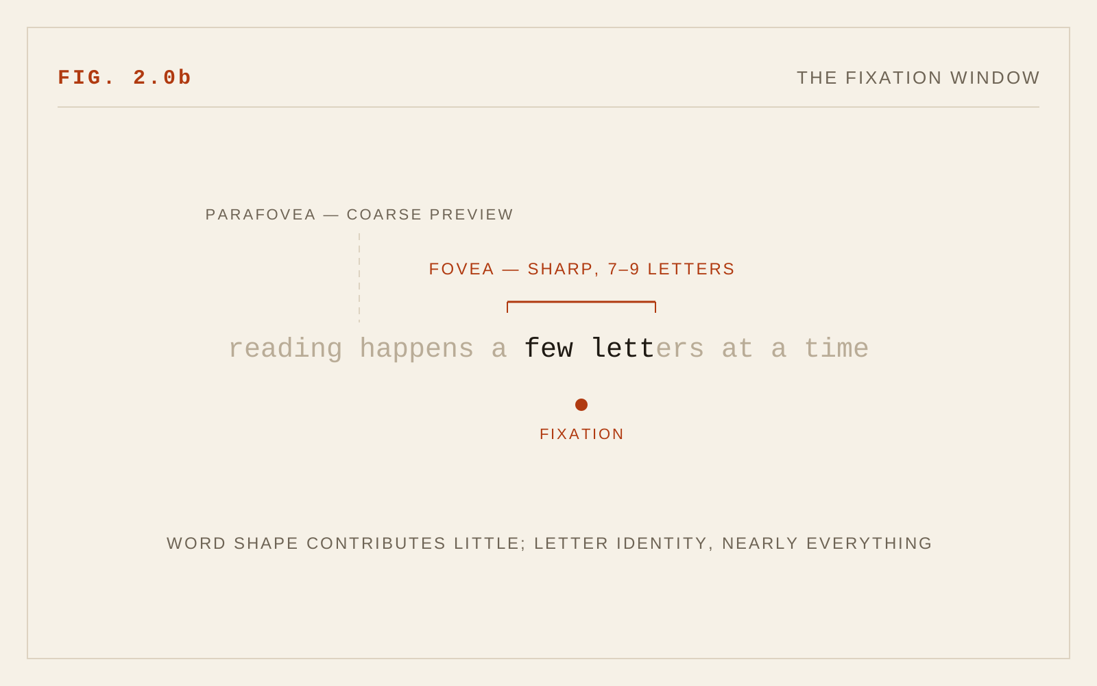
In 2005, much typographic advice rested on the word-shape model: the idea that skilled readers recognize words by their overall silhouette — the pattern of ascenders and descenders forming a "Bouma shape." That model has been superseded. The consensus in reading science, argued influentially in Kevin Larson's 2004 review of the psychological literature and reinforced by two decades of subsequent work, is parallel letter recognition: readers identify the component letters of a word simultaneously, and word recognition is built from that letter-level evidence. Word shape contributes little; letter identity contributes nearly everything. Chapter 2.1 takes up the consequences for word case in detail.
The mechanics of eye movement, by contrast, were already well established and have only been confirmed. Reading is not a smooth sweep. The eyes move in rapid jumps — saccades — separated by brief stops — fixations — of roughly a fifth to a quarter of a second, during which nearly all visual intake happens. Only a small central region of each fixation (the fovea) delivers sharp detail; a wider surrounding span supplies coarse preview information that helps the eyes plan the next jump. Skilled readers take in several letters to the right of fixation, skip short predictable words, and occasionally jump backward (regressions) when comprehension stumbles.
This model turns typographic rules from folklore into engineering. Comfortable line lengths work because the return sweep from line end to line start is the longest, most error-prone saccade on the page. Adequate line spacing works because it keeps the return sweep from landing on the wrong line. Even word spacing matters because the spaces between words are the landmarks saccade planning steers by. Ragged-right beats justified because justification redistributes those landmarks unevenly, injecting rivers of inconsistent spacing that disturb saccade targeting — a real cost for all readers and a severe one for readers with dyslexia or low vision.
Spacing, Measure, and the Updated Numbers
The Version 1 guidance survives with adjustments.
- Word spacing. Keep it even; avoid full justification on the web, where hyphenation and justification engines remain crude. If justification is demanded, enable hyphenation and check the result at narrow widths.
- Letter spacing. The 2005 suggestion of slight tracking increases holds for small sizes and for capitals, but modern text faces at body sizes are spaced correctly by their designers — the more important requirement is tolerance: WCAG 2.2's Text Spacing criterion (1.4.12) requires content to survive user-applied increases to letter, word, line, and paragraph spacing. Design so those overrides do not break layouts.
- Line spacing. Roughly 1.4 to 1.6 times the type size for body text; longer lines need the higher end. WCAG's own reference point is line spacing of at least 1.5 within paragraphs.
- Measure. The 55–65 characters-per-line target from 2005 remains a sound center; anything from about 45 to 75 characters reads comfortably. The modern refinement is responsiveness: set measure in ch-based or content-based units so it holds across viewports, and remember that at 200% zoom (WCAG 1.4.4) and reflow conditions (1.4.10) your measure must degrade gracefully rather than collapse.
Hierarchy and the Shape of Information
Type hierarchy earns its place in a readability chapter because saccades are not confined to sentences — readers navigate pages the same way, sampling and jumping. Clear size and weight contrast between heading levels, honest use of semantic heading elements (which double as the navigation skeleton for screen reader users), and generous space above headings all reduce the cost of finding one's place. Front-load headings and links with their distinguishing words: readers — and especially screen reader users skimming a headings list or link list — decide from the first two or three words.
Indentation and spacing conventions from print still serve: either indent paragraphs or space them, not both, and keep the signal consistent so the reader's eye learns it once.
Writing as Typography
The 2005 chapter closed with writing quality, and rightly — no typographic setting rescues prose the reader cannot parse. The intervening years institutionalized the point. Plain-language practice is now codified in standards and government mandates in several countries, and WCAG 3.0's drafts treat clear language as an accessibility dimension in its own right. The working rules remain the ones the original cited in spirit: prefer common words, short sentences, active constructions; state the point before the elaboration; cut what does not serve the reader. Fixations lengthen and regressions multiply on rare words and tangled syntax — plain writing is measurably easier to read, not merely politer.
In CSS
p {
  max-width: 65ch;        /* measure, set in characters */
  text-align: left;       /* ragged right keeps word spacing even */
  text-wrap: pretty;      /* better rag, fewer orphans */
}
Recommendations
- Treat readability as a system: type choice, spacing, measure, hierarchy, and prose quality fail or succeed together.
- Keep body measure near 45–75 characters, ideally 55–65, and preserve it responsively across zoom and reflow.
- Set line spacing at 1.4–1.6 times type size; more for longer lines.
- Use ragged-right alignment; avoid full justification on the web.
- Ensure layouts survive user spacing overrides per WCAG 1.4.12.
- Build hierarchy with size, weight, and space, on a semantic heading structure; front-load headings and links.
- Write plainly: common words, short sentences, point first.
- Let the reading model guide judgment calls — anything that makes saccade targets more predictable and letters easier to identify is working with the reader, not against them.