The practical advice in this chapter has not changed in twenty years: set continuous text in sentence case, and reserve capitals for short, deliberate uses. What has changed — decisively — is the explanation. Version 1 of this document stood at an awkward crossroads, citing Kevin Larson's 2004 review of word recognition research while noting that typographers continued to lean on the older word-shape model "for practical and historical reasons." Two decades on, the crossroads has resolved. The word-shape model is not a live scientific position anymore, and typography is better served by understanding why the correct model still yields the same practical rules.
What Changed Since 2005
The word-shape story — often associated with the "Bouma shape," the envelope a lowercase word forms with its ascenders and descenders — held that skilled readers recognize familiar words by their silhouettes, and that ALL CAPS reads poorly because every word becomes an undifferentiated rectangle. It was intuitive, teachable, and repeated in nearly every typography text of the twentieth century, including the 1998–2005 sources this document originally drew on.
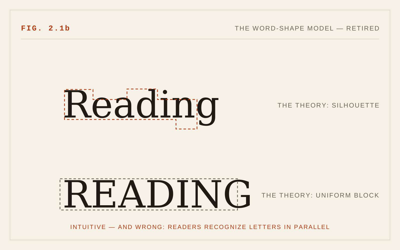
The evidence never supported it well, and the psychological literature Larson summarized has since hardened into consensus: word recognition proceeds by parallel letter recognition. During each fixation, the visual system identifies the component letters of a word simultaneously — not one by one, and not as a gestalt outline — and word identity is assembled from that letter-level evidence, constrained by context and expectation. Several classic findings that once seemed to favor word shape have cleaner explanations under this model. The word-superiority effect (letters are recognized more accurately inside real words than in isolation or in nonwords) reflects interaction between letter-level and word-level processing, not silhouette matching. Readers also handle case-alternated text (LiKe ThIs) far better than a shape model would predict — the shape is destroyed, yet reading survives, slowed but functional.
So why does all-caps text reliably read somewhat slower in studies? Two reasons, neither of them silhouettes. First, practice: virtually everything we have read since childhood is set predominantly in lowercase, and reading speed tracks familiarity. Notably, studies that trained readers on all-caps text found the deficit shrinking with practice — hard to explain if capitals were inherently unreadable, easy to explain if lowercase is simply the format we have overlearned. Second, letter discriminability: capitals are more uniform than lowercase — similar heights, similar widths, more shared vertical and rectangular strokes — so individual letters take marginally longer to tell apart, and parallel letter recognition is only as fast as its slowest evidence. Lowercase letters differ in height, in extenders, and in construction, giving the identification process more distinctive features to work with.
The practical rule survives the theory change intact. That is worth pausing on: it is a healthy example of a field keeping a correct practice while discarding an incorrect explanation.
The Updated Case for Sentence Case
For continuous text — paragraphs, articles, anything a reader inhabits for more than a sentence — sentence case wins on every current ground.
- Lowercase letters are individually more discriminable, so the letter-recognition machinery runs faster.
- Lowercase is what readers have practiced on for their entire literate lives; familiarity is a real, compounding advantage, and it is strongest for the readers with the least capacity to spare — people with low vision, dyslexia, or limited reading fluency.
- All caps occupies roughly 30–40% more horizontal space at equal point size, shortening effective measure or forcing smaller sizes — both readability costs independent of recognition speed.
- Extended capitals carry cultural signal: they read as shouting, which is a comprehension and tone problem even when it is not a legibility one.
Where Capitals Still Belong
None of this banishes capitals; it scopes them. Short labels, buttons, navigation items, small headings, abbreviations, and wayfinding text are legitimate all-caps territory — settings of one to three words, where recognition is at-a-glance rather than continuous, and where the uniform texture of capitals can be a deliberate design voice. The craft requirements are the same ones the tradition always taught: add letter-spacing (roughly 0.05 to 0.1 em) because capitals are fitted for mixed-case company, not for each other; keep the strings short; and prefer a weight and size with open, distinct forms.
Small caps get a more generous verdict than Version 1 gave them. The original advice to avoid them was really advice to avoid fake small caps — scaled-down capitals with spindly strokes and cramped fit. True small caps, drawn by the designer and accessed via font-variant-caps: small-caps in fonts that actually contain them, are a refined tool for abbreviations and subheadings. The rule is the recurring rule of this whole document: never let software synthesize what a designer should have drawn. If the font lacks real small caps, do not use small caps.
For headings, sentence case has quietly won the platform wars — major interface guidelines have drifted toward it over title case — and it is the accessible default: easier to scan, kinder to localization, and free of the which-words-capitalize ambiguity that title case imposes on writers.
In CSS
/* Caps are a style, not typed characters */
.label {
  text-transform: uppercase;
  letter-spacing: 0.08em;   /* caps need air */
  font-size: 0.75rem;
}
.abbr-smallcaps { font-variant-caps: all-small-caps; }
Recommendations
- Set all continuous text in sentence case; the practice stands even though the word-shape rationale does not.
- Explain the rule correctly: parallel letter recognition, practice effects, and capital-letter similarity — not silhouettes.
- Reserve all caps for short labels, navigation, and small headings of a few words at most.
- Letter-space all-caps settings by roughly 0.05–0.1 em; never letter-space lowercase body text decoratively.
- Apply stylistic capitalization with text-transform, keeping source text normally cased for screen readers and reuse.
- Use small caps only when the font contains true small caps via font-variant-caps; never synthesized ones.
- Prefer sentence case over title case for headings and interface text.
- Retire the Bouma-shape explanation from style guides and design education; correct theory produces more durable practice.