Kerning is the adjustment of space between two specific characters; word spacing is the rhythm of gaps between words across a line. Both serve the same goal: a texture even enough that the eye moves through text in smooth sweeps rather than stumbling over dark clots and white holes. In 2005, this chapter argued that spacing quality was largely at the mercy of the typeface and the rendering engine, and that justified alignment on screen degraded readability. Twenty years on, the first claim needs substantial revision. The second, with one important caveat, still stands.
What Changed Since 2005
The original edition treated kerning as something the web mostly could not do. Fonts were rasterized to coarse pixel grids, kerning pairs were often ignored by browsers, and designers were told to pick faces that survived the neglect. That world is gone. Every modern browser applies OpenType kerning to body text by default — the CSS property font-kerning defaults to auto, which enables kern data at text sizes — and subpixel positioning means those adjustments actually render. The practical advice has inverted: you no longer fight for kerning; you inherit it, and your job is not to break it.
The second major change is regulatory. WCAG 2.1 introduced Success Criterion 1.4.12 Text Spacing (Level AA, carried into WCAG 2.2), which requires that content lose no functionality or content when a user overrides spacing — specifically letter spacing to 0.12 times the font size and word spacing to 0.16 times the font size, along with line height and paragraph spacing increases. This reframes spacing entirely. It is not only an aesthetic decision the designer makes once; it is a variable the reader is entitled to change. Fixed-height containers, tight buttons, and truncation-prone labels that clip or overlap when a user applies these overrides are accessibility failures. Test your layouts with a text-spacing bookmarklet or browser extension before shipping.
Third, CSS now exposes real controls. The word-spacing property adjusts inter-word gaps directly, letter-spacing handles tracking (see the next chapter), and font-kerning and font-feature-settings give explicit access to OpenType behavior. Newer still, text-wrap: pretty asks the browser to spend extra effort on line-breaking — avoiding orphans and poor break points — which quietly improves spacing texture in ragged-right text without any manual intervention.
Kerning in Practice
Because kerning is on by default, the remaining failures are mostly self-inflicted. Aggressive positive letter-spacing effectively overrides kern pairs by drowning them in added space, which is one reason tracking body text is risky. Poorly built display fonts still ship with sparse kern tables, and at headline sizes those gaps are conspicuous — the classic troublesome pairs such as a capital T or V followed by a lowercase vowel. At display sizes it is reasonable to fix an individual pairing by hand, but if a face needs constant correction, it is the wrong face.
One genuine 2005 concern survives: font quality still matters. Variable fonts and professionally produced webfonts generally carry thorough spacing and kerning data; free fonts of uncertain provenance often do not. Evaluate a candidate face by setting real paragraphs, not a specimen line.
Word Spacing and Justification
The original finding — that justified alignment decreases readability on screen — remains correct in its usual form, but the mechanism deserves precision. Full justification forces each line to a fixed measure by stretching or compressing the spaces between words. Without hyphenation, the algorithm has few break points to work with, so some lines end up with cavernous word gaps. When those gaps stack vertically across successive lines, they form "rivers" of white space running down the paragraph. Rivers are more than ugly: they compete with the horizontal reading path, and readers who rely on steady spacing cues — including many dyslexic readers — are disproportionately affected. Uneven word spacing disrupts the parafoveal preview that lets the eye plan its next saccade.
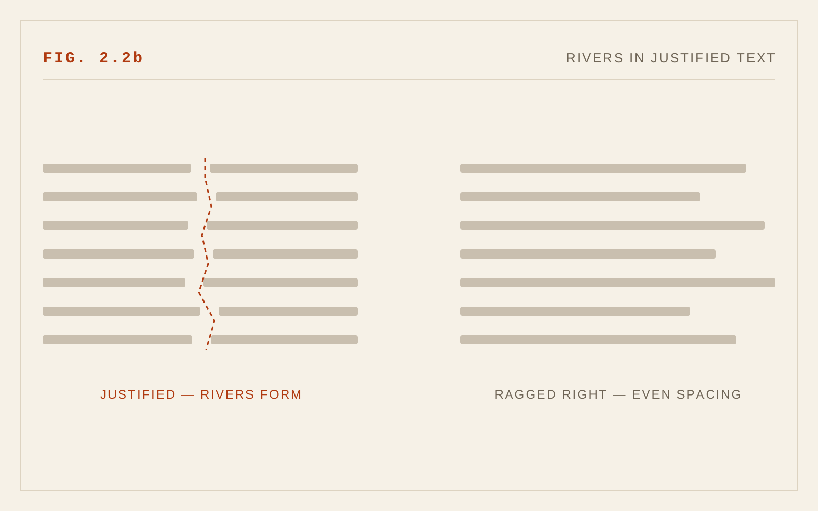
Print solved this centuries ago with hyphenation and justification working together, and the web can now do the same in principle: CSS hyphens: auto enables dictionary-based hyphenation in most browsers, and it dramatically reduces the spacing variance of justified text. But browser justification remains a simple line-by-line algorithm, not the paragraph-level optimization found in professional page-layout software, so even hyphenated justified text on the web rarely matches the evenness of a well-set book. The pragmatic conclusion: use ragged-right (left-aligned) text as the default for screen reading. If a design genuinely requires justification, enable hyphenation, keep the measure generous, and inspect the result at narrow widths — justified text in a narrow column is where rivers breed.
Note also that WCAG 2.2's Success Criterion 1.4.8 Visual Presentation (Level AAA) explicitly lists "text is not justified" among its requirements for blocks of text. Even at the AA level most teams target, that is a strong signal about where the standard's authors landed.
Word Spacing as a Design Variable
Direct manipulation of word-spacing is rarely needed for body text — the typeface's built-in space glyph is usually right — but it earns its keep in edge cases: slightly opening word gaps in all-caps navigation labels, or tightening them in large display settings where default spaces look oversized. Any adjustment should be specified in em-relative units so it scales with the text, and it must tolerate the user overrides mandated by 1.4.12. If your layout only works at exactly the spacing you chose, it does not work.
In CSS
body {
  font-kerning: normal;   /* on by default — never disable it */
  text-align: left;       /* justification without hyphenation makes rivers */
}
p { text-wrap: pretty; }

/* If justification is required, hyphenate: */
.justified { text-align: justify; hyphens: auto; }
Recommendations
- Set body text ragged-right by default; treat full justification as an exception requiring hyphens: auto and testing at narrow widths.
- Leave font-kerning at its default; do not disable kerning, and avoid heavy letter-spacing that overwhelms kern pairs.
- Use text-wrap: pretty on body copy where supported to improve break points and spacing texture at near-zero cost.
- Specify any word-spacing or letter-spacing adjustments in em units, never pixels.
- Verify layouts survive WCAG 1.4.12 overrides — letter spacing 0.12em, word spacing 0.16em, line height 1.5 — without clipping, overlap, or lost content.
- Choose typefaces with complete kerning and spacing tables; judge them by set paragraphs, not specimens.