Tracking — letter-spacing, in CSS terms — is the uniform adjustment of space between all characters in a run of text, as distinct from kerning, which adjusts individual pairs. The 2005 edition of this chapter recommended a modest increase in letter spacing for text blocks on screen, reasoning that coarse pixel rendering crowded letterforms and that a little extra air helped. That advice was a product of its rendering environment, and it no longer holds as a general rule. The updated position is more conditional: tracking is a size-dependent tool that helps at the extremes of the type scale and usually hurts in the middle, where body text lives.
What Changed Since 2005
Three things overturned the original recommendation. First, rendering improved. In 2005, screen fonts were hinted to a coarse grid and letter-spacing could only be adjusted in whole-pixel increments — the original text noted that constraint explicitly. Subpixel positioning, high-density displays, and fractional CSS values (letter-spacing: 0.01em is perfectly legal) removed both the crowding problem and the integer restriction. Body faces designed for screens now sit at their intended spacing, and the designer's rationale for opening them up has largely evaporated.
Second, the research picture matured — and became less tidy. Studies on increased letter spacing for readers with dyslexia drew wide attention in the early 2010s, with some reporting meaningful gains in reading speed and accuracy for children. But subsequent work has been mixed: effects vary with the reader, the typeface, the language, and how spacing interacts with word spacing. For low-vision readers, the evidence is similarly equivocal — extra spacing can reduce crowding (a real perceptual phenomenon in peripheral and low-acuity vision), yet it also lengthens lines and pushes words apart, which carries its own costs. The honest summary in 2026: increased spacing helps some readers in some conditions, and there is no universal setting that benefits everyone. That argues against baking a compromise into the stylesheet and for ensuring readers can apply their own.
Third, that is exactly what WCAG formalized. Success Criterion 1.4.12 Text Spacing (Level AA in WCAG 2.1 and 2.2) requires that content tolerate a user-applied letter-spacing of 0.12 times the font size — along with word spacing at 0.16em and line height at 1.5 — with no loss of content or functionality. The designer's obligation is not to choose the perfect tracking; it is to build layouts that survive when the reader chooses theirs.
Tracking Is Size-Dependent
The most durable principle in this chapter is that appropriate tracking varies inversely with size. Type designers space fonts for a target range of sizes; when you set text far outside that range, the spacing needs correction.
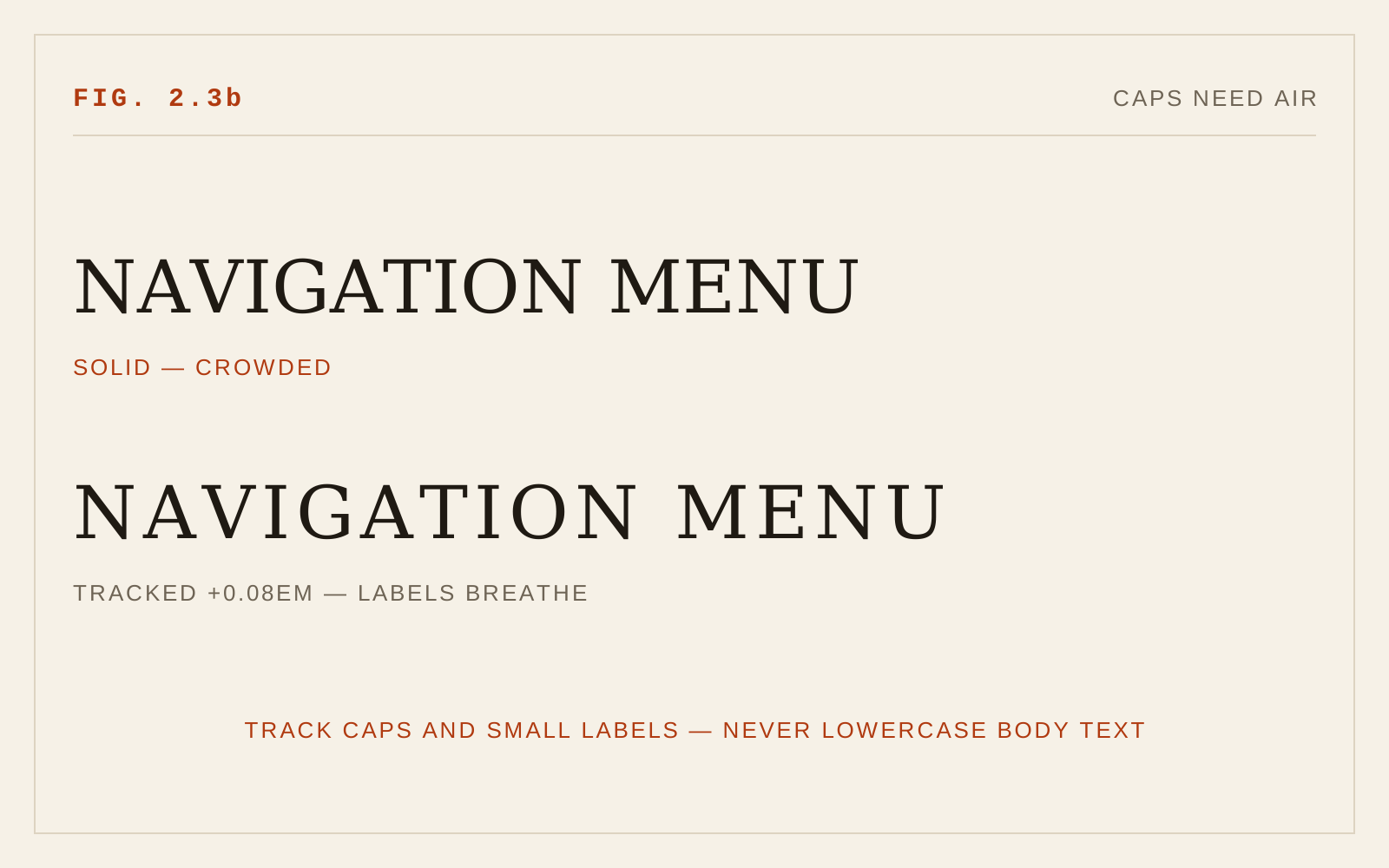
At small sizes — captions, footnotes, data labels, UI microcopy — letterforms crowd perceptually even when metrically correct, and a small positive track (on the order of a hundredth or two of an em) genuinely improves legibility. All-caps and small-caps settings are the strongest case: capitals were designed to begin lowercase words, not to sit beside each other, and uppercase-only labels almost always benefit from opened tracking, often five to ten hundredths of an em.
At body sizes, the default spacing is the designer's intent, and departures are usually losses. Positive tracking weakens word shapes — the "bouma" envelope readers use for rapid word recognition — and dilutes the contrast between letter space and word space that signals word boundaries. Negative tracking at body sizes is worse, reintroducing the crowding that harms low-vision readers most.
At display sizes, the correction reverses: large headlines often look loose at default spacing because the metrics were tuned for smaller sizes, and a slight negative track tightens them. This is a refinement, not a requirement, and it must never be applied to text a user might enlarge into body-reading duty.
Variable Fonts Versus Mechanical Tracking
Mechanical tracking — inserting uniform space between glyphs drawn for a different rhythm — is always a compromise. Variable fonts offer something better. Faces built with an optical size axis change their actual drawing across sizes: smaller optical sizes carry wider spacing, sturdier strokes, and larger x-heights, while display sizes tighten and refine. Browsers apply this automatically via font-optical-sizing: auto when the axis exists. Where a variable font provides optical sizing (or, more rarely, a dedicated grade or spacing axis), prefer it to manual letter-spacing: the designer has solved per-size spacing holistically rather than by uniform padding. Mechanical tracking remains the fallback for static fonts and for conventions like all-caps labels that no axis addresses.
Practical Cautions
Always specify letter-spacing in em units so it scales with font size; a pixel value that is subtle at 16px becomes destructive when the user zooms or enlarges text. Remember that added tracking effectively overrides kerning pairs — another reason to keep values small. And test every component under the 1.4.12 override values: tracked-out navigation labels in fixed-width containers are a common place for text to clip or wrap destructively when a reader adds their own 0.12em.
In CSS
p { letter-spacing: normal; }            /* body text: hands off */
.caps-label { letter-spacing: 0.08em; }  /* open short caps runs */

/* Must survive the WCAG 1.4.12 user override without breaking:
   letter-spacing: 0.12em applied to all text */
Recommendations
- Do not track body text; the typeface's default spacing is the correct default.
- Add modest positive tracking (roughly 0.01–0.02em) to very small text, and more (roughly 0.05–0.1em) to all-caps or small-caps labels.
- Apply slight negative tracking only at large display sizes, and only after checking the result at user-enlarged sizes.
- Prefer variable fonts with an optical size axis over mechanical tracking; enable font-optical-sizing.
- Specify all letter-spacing in em units, never pixels.
- Verify no clipping, overlap, or lost functionality when users apply WCAG 1.4.12 spacing overrides.
- Treat spacing personalization as the reader's prerogative: build tolerance, not a single "accessible" tracking value.