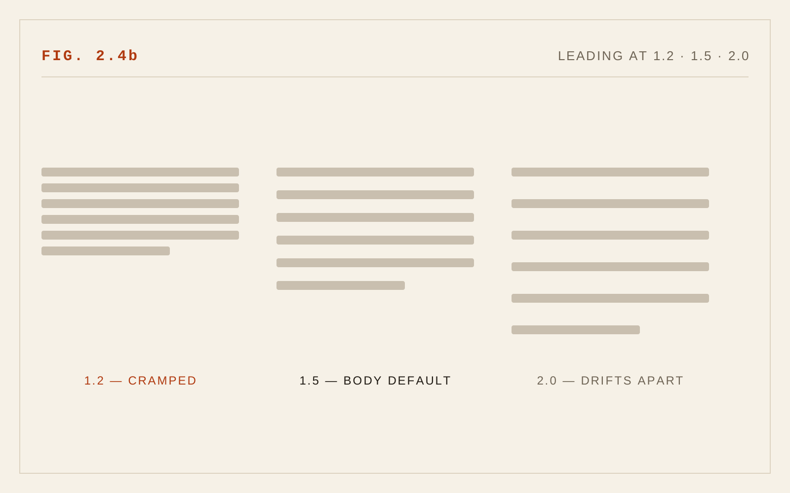
The space between lines of text — leading in print, line-height in CSS — is among the most consequential settings in screen typography. Its job is navigational: enough white space between lines lets the eye complete a line, execute the long return sweep to the left margin, and land on the correct next line rather than rereading the current one or skipping ahead. The 2005 edition recommended roughly 140% of font size, noting that browser defaults of 100–120% were too tight, especially for low-vision readers. That recommendation has aged well; if anything, practice and standards have moved slightly past it.
What Changed Since 2005
The original figure of about 1.4 was ahead of its time and now sits at the conservative end of mainstream practice. Body text on well-set sites in 2026 typically runs between 1.4 and 1.6, and the accessibility floor has been formalized: WCAG's Success Criterion 1.4.12 Text Spacing (Level AA) requires that content survive a user-applied line height of 1.5 times the font size without loss of content or functionality, and the older 1.4.8 Visual Presentation (Level AAA) asks for line spacing of at least 1.5 within paragraphs outright. The practical reading: 1.5 is not an aspiration, it is the value your layout must at minimum tolerate — and for most body settings it is simply a good default.
The second change is how line height is specified. In 2005, designers set leading in pixels or percentages. Modern CSS practice is emphatic: use unitless values (line-height: 1.5, not 24px or 150%). The distinction matters because of inheritance. A unitless value is inherited as a ratio and recomputed against each element's own font size; a pixel or percentage value is computed once and inherited as a fixed length. Set line-height: 24px on a page body and a nested heading at 32px will render with lines overlapping. Unitless line-height makes the whole cascade scale correctly — which is also what keeps layouts intact when users enlarge text.
Third, layouts themselves changed. Fixed-height text containers were common in 2005 and are the main casualty of the 1.4.12 requirement: a box sized to exactly three lines of text at line-height 1.3 will clip its content when a reader overrides to 1.5. Containers holding text should size themselves from their content, using min-height where a minimum is needed, never a fixed height.
Leading and Measure Are One Decision
The most important refinement to the original chapter is that line height cannot be chosen in isolation. Leading and line length (measure) are interdependent, and the mechanism is the return sweep. On a short line, the eye's leftward return is a short hop and mistargeting is rare, so tighter leading is tolerable. On a long line, the return sweep is long and imprecise; generous leading gives the eye a wider "landing strip" and makes doubling — rereading the same line — much less likely. This is a long-standing finding of legibility research, observed from print studies onward: acceptable leading rises with measure.
In practice: a 45-character sidebar note can read comfortably at 1.4; a 75-character article column wants 1.6 or more. If a layout forces long lines, compensate with leading. Better still, constrain the measure (the subject of the next chapter) so leading can stay in the comfortable middle range.
Typeface variability, noted in the original, still applies. Line-height is calculated from the font size, but what the reader perceives is the white channel between the visual mass of one line and the next — and that depends on x-height, ascender and descender length, and stroke weight. A large x-height face like Verdana fills its em more fully and reads tighter at a given line-height than a small x-height face at the same setting. Dark, bold, or condensed faces likewise want more air. Judge leading by looking at set paragraphs, not by trusting a number.
Headings Are Different
The 1.4–1.6 guidance applies to continuous body text. Headings follow the opposite logic: at large sizes, a proportional line height leaves enormous gaps between wrapped lines, visually severing the heading from itself. Multi-line headings read best tight — typically 1.1 to 1.25, approaching 1.0 for very large display settings. Because unitless line-height inherits as a ratio, heading styles should set their own tighter values explicitly rather than inheriting body leading. WCAG's spacing requirements concern blocks of text, not display headlines, but headings must still not clip when users apply overrides — another reason to avoid fixed-height hero containers.
Two smaller notes. First, extremes hurt in both directions: the original's warning about excessive leading stands, since lines floating in too much white space make the next-line search harder and fragment the paragraph as a unit — beyond roughly 2.0, body text starts to fall apart. Second, interfaces are text too: buttons, form labels, and navigation need line-height sane enough to survive wrapping and user overrides, and the common habit of centering single-line UI text with tricks that assume it never wraps is a recurring 1.4.12 failure.
In CSS
body { line-height: 1.5; }      /* unitless — scales with size */
h1, h2 { line-height: 1.15; }   /* display sizes want less */
figcaption { line-height: 1.4; }

/* Longer measures need more leading: */
.wide-column { line-height: 1.6; }
Recommendations
- Set body text at a line height of 1.5 as the default; adjust within roughly 1.4–1.7 based on typeface and measure.
- Always use unitless line-height values so the ratio inherits and scales correctly.
- Increase leading as line length grows; long measures need more air for the return sweep.
- Tighten headings to roughly 1.1–1.25, set explicitly on heading styles.
- Never fix the height of containers that hold text; let content determine height, with min-height where necessary.
- Test with a text-spacing override (line height 1.5, per WCAG 1.4.12) and at 200% zoom to confirm nothing clips or overlaps.
- Evaluate leading visually per typeface — x-height and weight change how the same number reads.