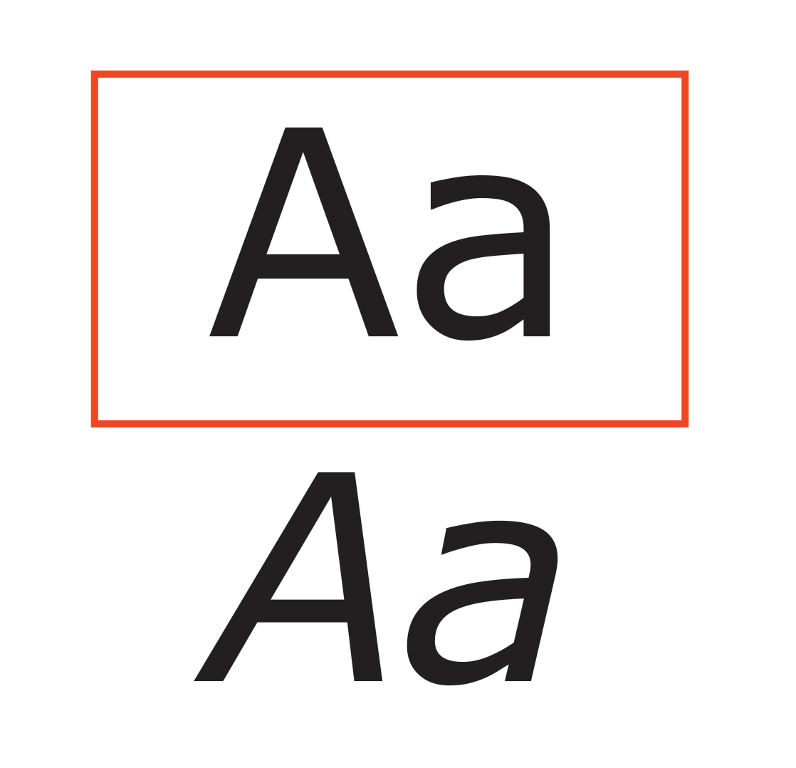
Use vertically oriented letters, also known as Roman letters. Slanted letters are often named italic.
It is harder for people with low-vision to discern the letterforms when they are angled or slanted.
Emphasis Alternative
Traditionally, italic fonts signal emphasis in typography. However, for accessibility we recommend the use of bold weights since they are more easily perceived than italic.
Original Plates