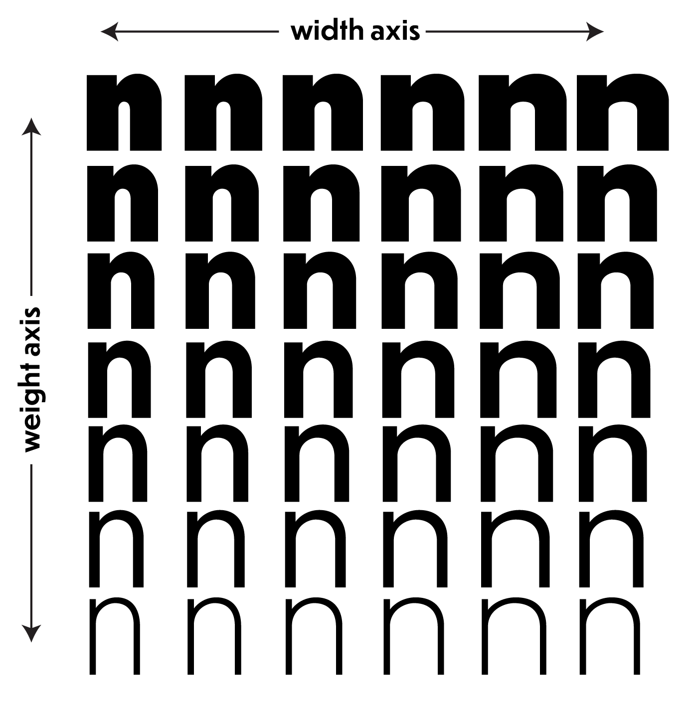
Use regular to slightly bold font weights. Avoid fonts that are thin or that are heavy to black in weight.
What to Avoid
- Light typefaces possess generous counter spaces but lack sufficient stroke contrast for users with low-vision
- Bold/black weights feature decreased counter spaces, reducing overall legibility
Rationale
Thin fonts compromise contrast for low-vision readers, while extremely heavy fonts reduce the white space inside letters, hindering readability for all users. The ideal weight balances stroke visibility with open counter spaces.
Original Plates