Design Nomenclature / Color
Value
Also called lightness, tone, luminance
This entry has not been translated yet and is shown in English.
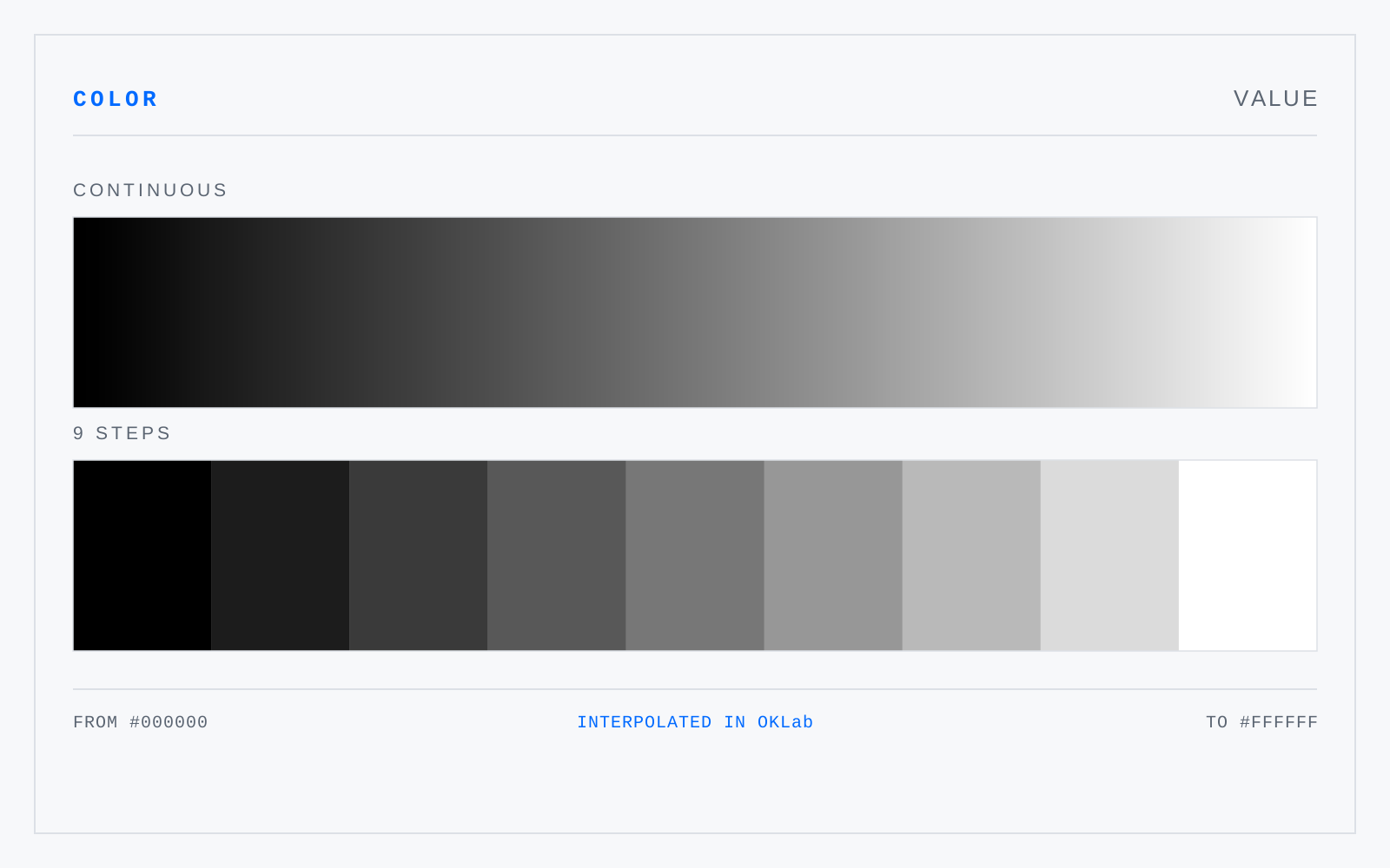
How light or dark a color is, independent of hue and chroma — the one attribute that survives conversion to greyscale. Value does the structural work: legibility, depth, and figure-ground separation all rest on value difference far more than on hue difference, and a composition that fails in greyscale was leaning on hue to hide it.
In practice
Painters say value, photographers say tone, printers say density, CSS says lightness. Same axis, four vocabularies — and HSL's lightness is not perceptual value.
Not to be confused with
- ChromaThe strength of a color measured against a neutral grey of the same value — how far it sits from the achromatic axis. Chroma is an absolute distance, so its ceiling is not uniform: it varies with hue and with value, which is why a Munsell chroma of 10 is near-maximal for a blue-green and unremarkable for a red.
- ToneA hue with grey added — chroma reduced without a committed move in value. Toning is how a palette is made to sit together: most color that reads as considered has been toned, because a shared grey pulls otherwise unrelated hues onto common ground and lets the saturated accent carry the emphasis.
- HSLA cylindrical remapping of RGB into hue, saturation, and lightness, with L running 0 to 100% and every fully saturated hue landing at L 50%. That is a fact about the geometry, not about perception: HSL yellow and HSL blue at L 50% differ enormously in the lightness anyone actually sees.