Design Nomenclature / Color
Chromatic adaptation
Also called color constancy, colour constancy, white balance
- Color
- Light & Optics
- 2D & 3D
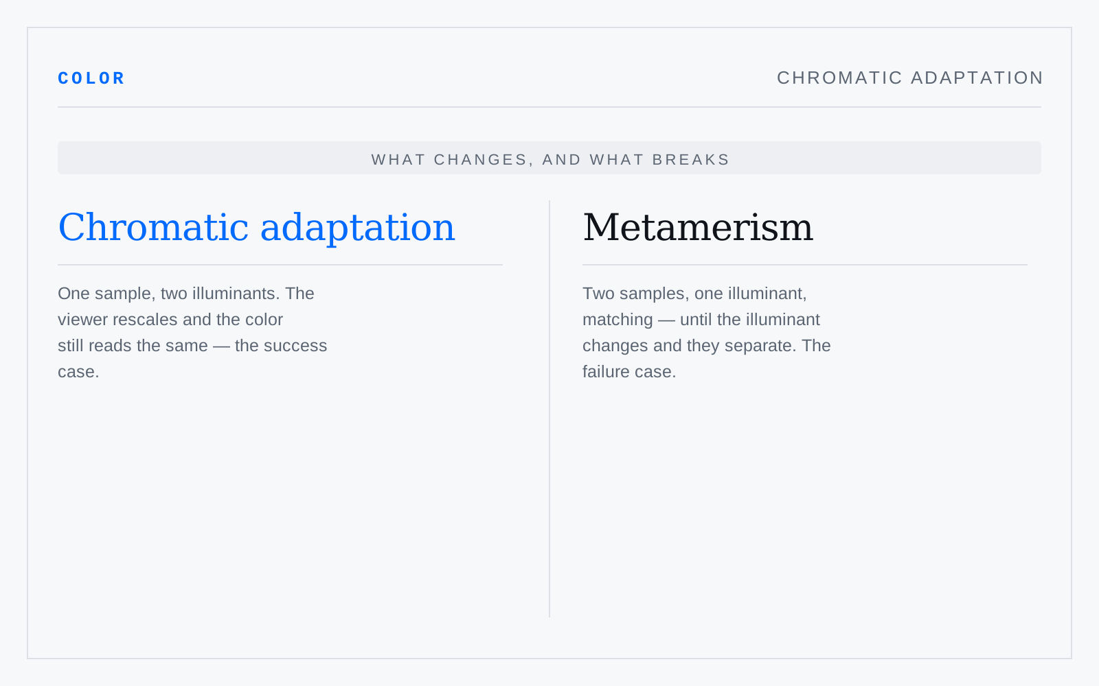
The visual system rescaling its cone responses to the prevailing illuminant, so a white shirt reads white under tungsten and under noon daylight despite radiating quite different spectra. Cameras approximate it as white balance; color management models it with transforms — Bradford, CAT16 — whenever a value crosses between white points.
In practice
The everyday name is color constancy: adaptation is the mechanism, constancy the result. The dress that broke the internet was an adaptation failure — no cue to settle the illuminant.
Not to be confused with
- MetamerismTwo samples with different spectral curves matching under one illuminant and separating under another. The match was never in the samples — it was in the three cone responses they happened to coincide on. Hence the fabric matched under shop light that splits apart in the street, and the conditional nature of every ink-to-screen approximation.
- White pointThe chromaticity a space agrees to call neutral: D65 for sRGB and Display P3, D50 for print and ICC's profile connection space. It is a choice rather than a measurement of anything absolute, and mismatching it is how images pick up a cast on the way from screen to press.